When a customer sees your product on a shelf, it’s often packaging—not the product itself—that delivers the first impression. But when you have multiple products or product lines, that moment becomes even more critical. Inconsistent packaging across SKUs can dilute your brand identity, confuse buyers, and create friction in the path to purchase. Cohesive packaging design, on the other hand, reinforces brand recognition, builds consumer trust, and creates a unified ecosystem that enhances your market presence.
At Sprout Studios, a Boston-based packaging design studio, we see packaging as a strategic brand asset. Done right, packaging design connects products, tells a consistent story, and amplifies your brand’s impact across categories and channels.
Why Brand Cohesion Matters in Packaging Design
Consumers encounter your brand in many places—from retail shelves and e-commerce platforms, to unboxing videos and social feeds. If your packaging lacks cohesion, every touchpoint feels disjointed. But when packaging shares a unified design language, customers can more easily recognize your brand, understand your product architecture, and feel confident in the quality inside.
Brand cohesion isn’t about making every package look identical. It’s about crafting a consistent experience across your portfolio—one that supports:
- Recognition: Faster visual recall across product categories
- Trust: Confidence that every product meets the same quality standards
- Emotional Connection: Familiar design cues that deepen brand affinity
Core Elements of a Cohesive Packaging System
Building a cohesive packaging system involves more than repeating a logo or color scheme. As a product packaging design studio, we develop flexible design frameworks that adapt to different products, audiences, and channels, and can scale across SKUs while remaining true to your brand’s identity.
- Visual Brand Language (VBL): This includes the use of color palettes, typography, iconography, imagery style, and graphic layout. Your VBL should be flexible enough to adapt to different product tiers or categories, while still clearly expressing your brand identity.
- Structural Design: Shape, form factor, and closure mechanisms can reinforce brand unity even before a consumer reads the label. Signature silhouettes or consistent touchpoints add physical familiarity that reinforces brand identity.
- CMF (Color, Material, Finish): Material choices—rigid vs. flexible, matte vs. glossy, natural vs. synthetic—play a big role in shaping consumer perception. Cohesion in CMF ensures products feel like they belong to the same family, even when their functions differ.
- Messaging & Hierarchy: A clear system for naming, descriptors, and benefit statements helps consumers navigate your offerings. Consistent tone and messaging structure strengthens your brand voice and improves shelf clarity.
Adapting Packaging Design Across Product Tiers and Categories
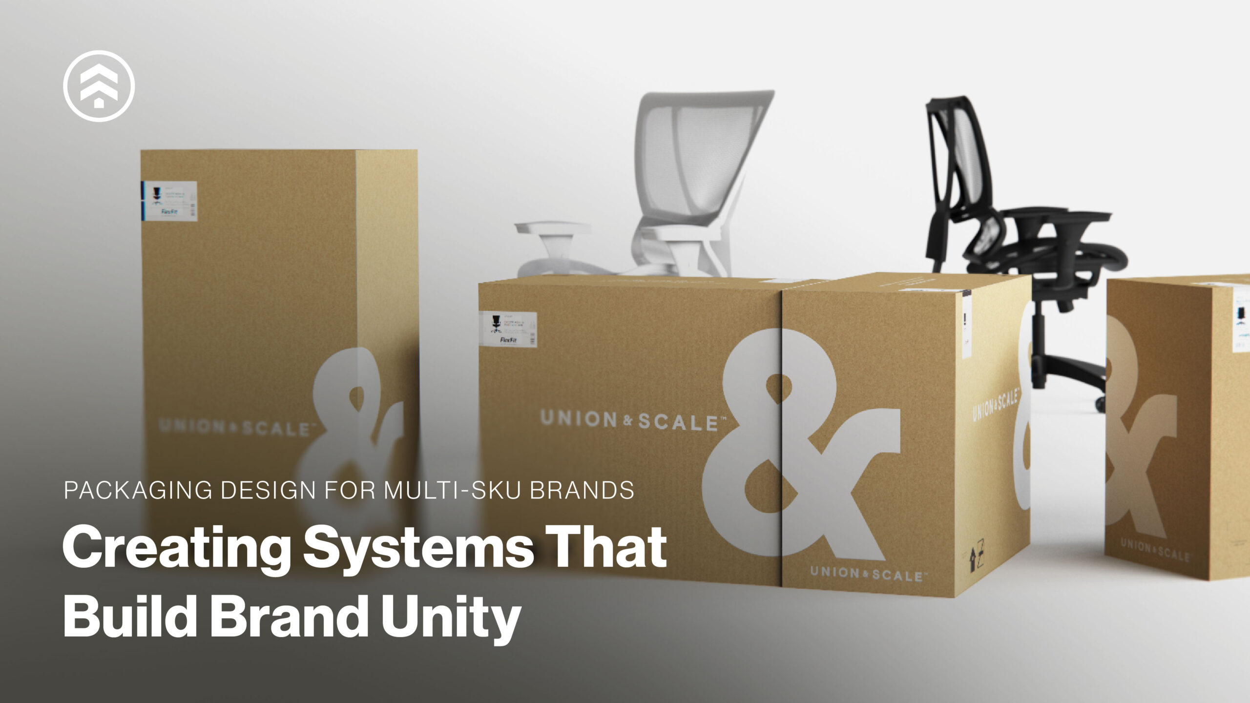
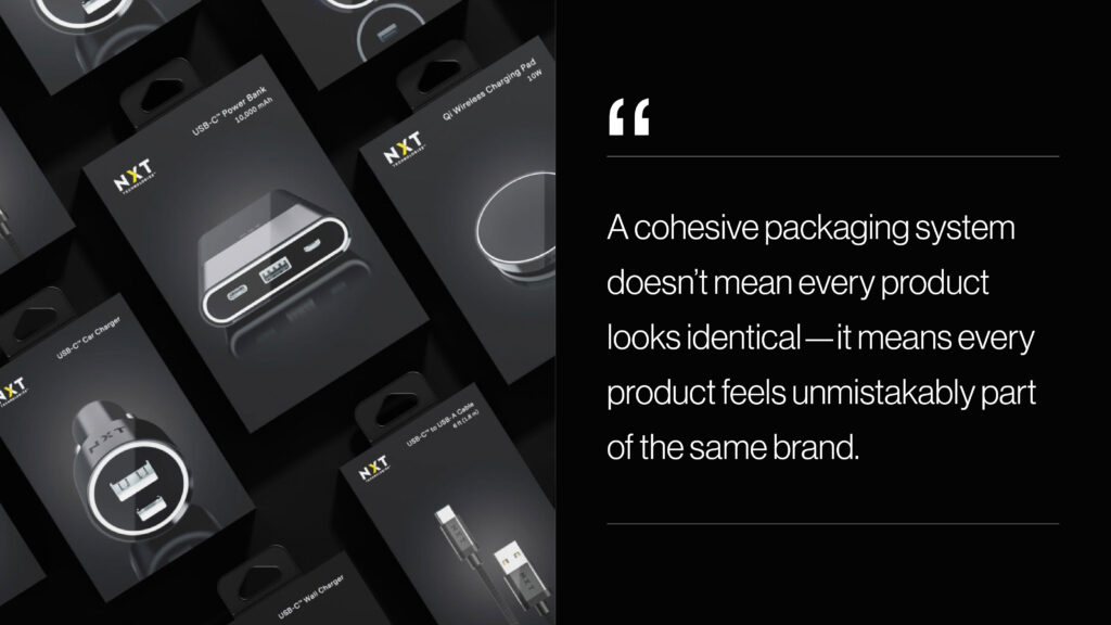
A cohesive packaging system doesn’t mean every product looks identical, it means every product feels unmistakably part of the same brand. As companies expand into new categories or tier their offerings by price, packaging must strike the right balance between consistency and flexibility.
The most successful systems follow a “branded house” model: a shared design foundation that allows for variation while preserving core brand elements. This ensures your premium line, entry-level SKUs, and category expansions all reinforce the same visual identity—even as they cater to different audiences or use cases.
Here’s how cohesion can flex across product lines:
- Tiered Product Lines: Premium SKUs might feature richer materials, foil accents, or custom structural details that signal quality. Value-tier items can maintain the same layout and branding but use more cost-effective finishes or substrates.
- New Categories or Product Extensions: A supplement brand expanding into ready-to-drink beverages might carry over signature colorways, iconography, and voice, even as form factors and materials shift. A beauty brand launching body care could adapt its visual language to new container shapes, but keep typography, messaging tone, and design hierarchy intact.
- Retail vs Direct-to-Consumer (DTC): Retail packaging might focus on visual shelf impact and quick-read benefits, while DTC packaging could emphasize unboxing experience and storytelling. Both should feel clearly part of the same brand system.
The goal is to balance consistency with differentiation—ensuring every product feels part of the same family, but with its own clear role.
Unified Packaging, Stronger Brand
Cohesive packaging systems deliver more than good looks. They offer real, measurable advantages:
- Stronger shelf presence: Products grouped visually draw more attention and appear more authoritative in their category.
- Higher consumer trust and brand recall: Shoppers feel confident buying across SKUs when everything “feels” like it’s from the same trusted source.
- Operational efficiency: Unified packaging systems can simplify production, reduce design time, and streamline supplier coordination.
Many top-performing brands leverage packaging cohesion to scale efficiently while staying recognizable in global markets, from Apple’s minimalist white boxes to Method’s iconic curvy silhouettes and consistent label systems.
Sprout’s Approach to Packaging Design for Multi-SKU Brands
When you have a diverse product portfolio, maintaining cohesion across SKUs becomes essential to building recognition, trust, and long-term brand equity.
At Sprout Studios, we specialize in product packaging design services that scale with you. We design packaging systems that unify your offerings under a clear, compelling visual and structural language. Whether you’re launching an entirely new product family or evolving an existing portfolio, we help ensure that every package works as part of a system—distinct where it matters, but always unmistakably “you.”
Our strength lies in the tight integration of strategy, design, and production. As a multidisciplinary packaging design agency, our team integrates:
- Industrial Design: We consider ergonomics, shelf presence, form factor, and user interaction to create structures that not only look great but function intuitively across use cases.
- CMF Strategy: We align color, materials, and finishes with your brand values—whether that’s premium sophistication, playful accessibility, or sustainable innovation.
- Brand Identity Development: We translate your brand’s visual language into packaging systems that scale, from iconography and typography to messaging tone and hierarchy.
- Engineering and Production Readiness: We design for manufacturability and supply chain realities, ensuring that your packaging system works as well in production as it does on the shelf.
From early concept sketches to dielines and vendor-ready production files, our process is built to support long-term growth and brand consistency. We consider:
- How each SKU contributes to a broader packaging ecosystem
- How your product line can grow without compromising visual integrity
- How to balance differentiation between tiers or categories with overall brand cohesion
By treating packaging as a strategic system—not just a one-off creative exercise—we help brands deliver a consistent experience across every customer touchpoint.
Partner With Sprout to Design a Packaging System That Scales
Your packaging should be a visual thread that ties your brand story together across SKUs and channels.
Looking for a packaging design studio that can unify your multi-SKU portfolio? Let’s talk. Reach out to our team to discuss how our product packaging design services can help strengthen your brand and support long-term growth.