Visual Identity Refresh
An evolving hard cider brand returns to their roots.
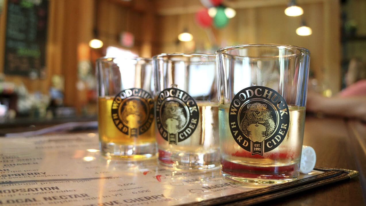
/ Woodchuck: Intro
Woodchuck
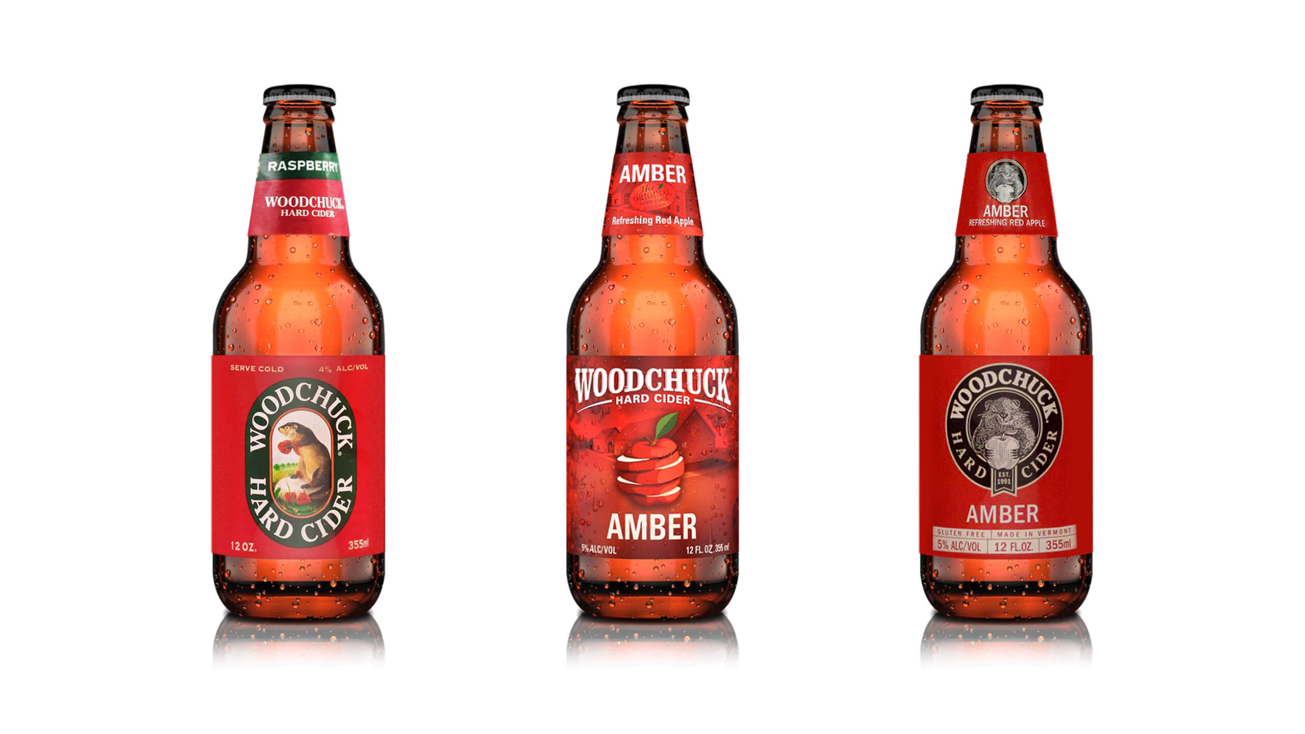
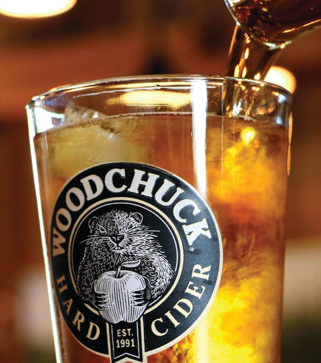
For more than two decades, Woodchuck Hard Cider was known for Chuck—the friendly mascot that made the Vermont brand approachable and recognizable. But when Chuck was phased out in favor of an apple icon, Woodchuck’s momentum faltered, and competitors like Angry Orchard surged ahead. Ahead of its 25th anniversary, Woodchuck sought to reestablish its identity, reconnect with loyal consumers, and reclaim its place as a leader in the hard cider market. Sprout partnered with Woodchuck to modernize the brand while honoring its heritage, creating a flexible design system that reintroduced Chuck and positioned the company for lasting growth.
/ Woodchuck: The Challenge
Heritage Without a Hero
Woodchuck had once been the top-selling cider in the U.S., but the absence of Chuck had diluted its personality and eroded consumer loyalty. Under Pabst Brewing Company’s ownership, the brand needed more than just a packaging update—it needed a revitalized identity that could:
- Restore recognition by bringing back its iconic mascot.
- Differentiate in a market increasingly dominated by Angry Orchard and other national players.
- Balance the brand’s Vermont heritage with a modern appeal.
- Create a scalable packaging system to support core flavors, seasonal editions, and limited releases.
The challenge was to deliver a fresh, contemporary identity that could carry forward the brand’s legacy while enabling future innovation.
/ Woodchuck: The Approach
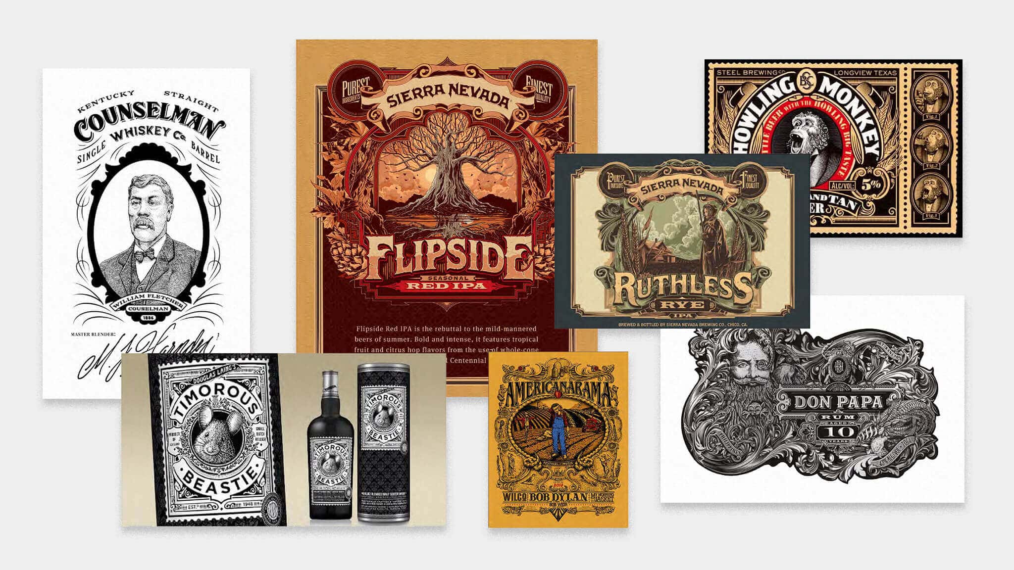
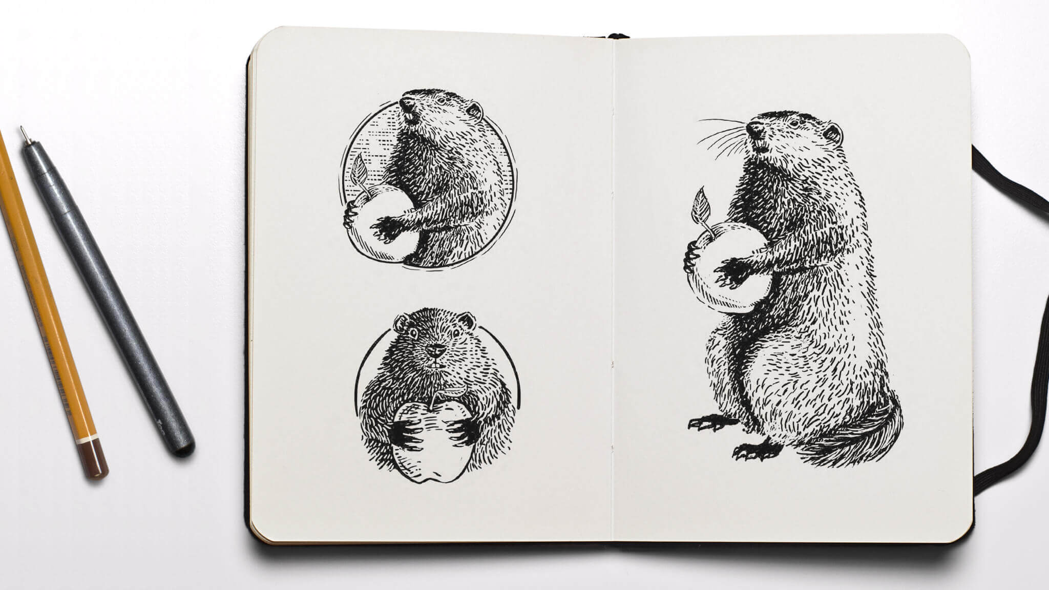
Bringing Chuck Back
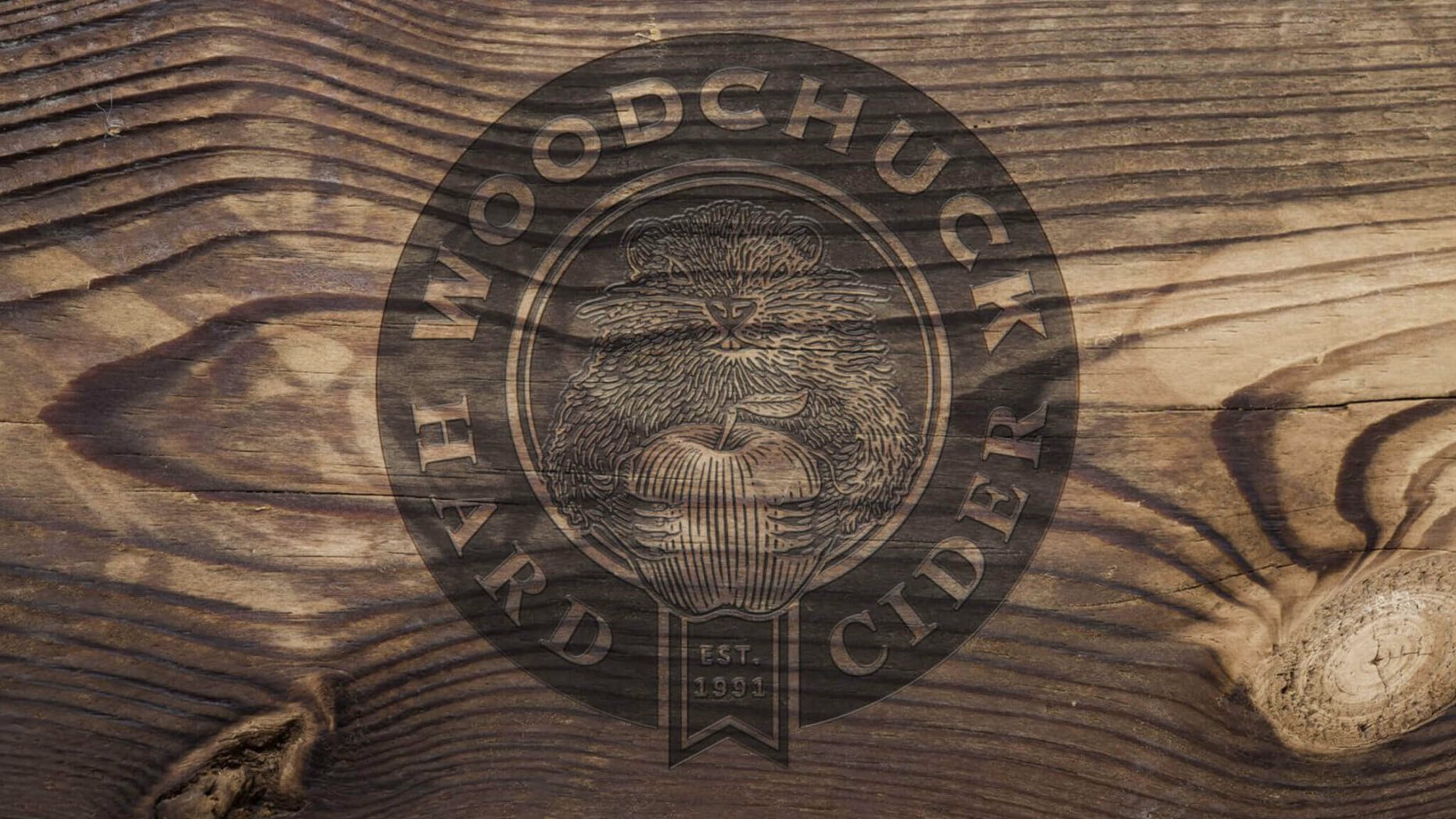
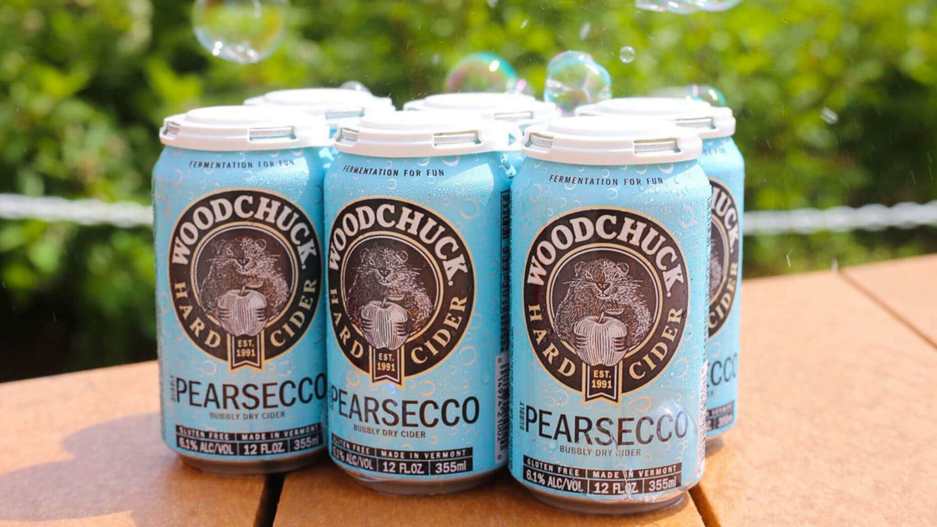
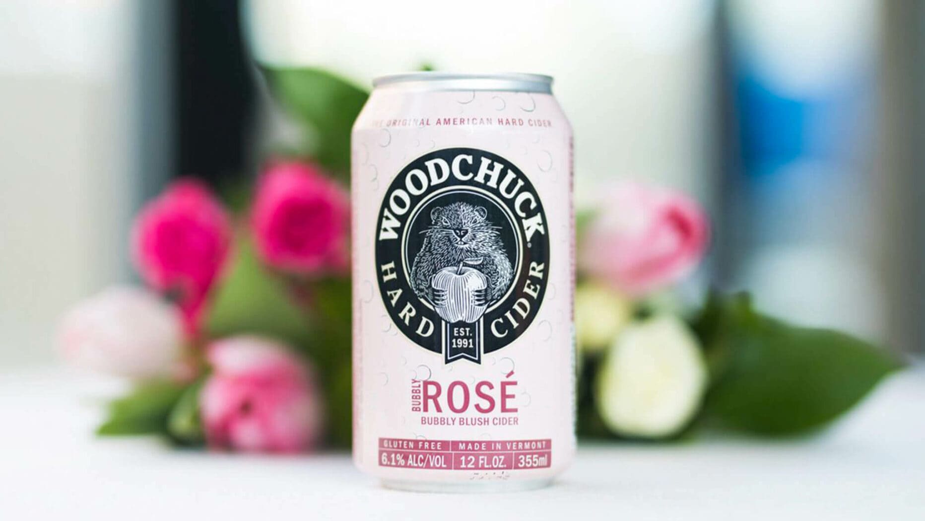
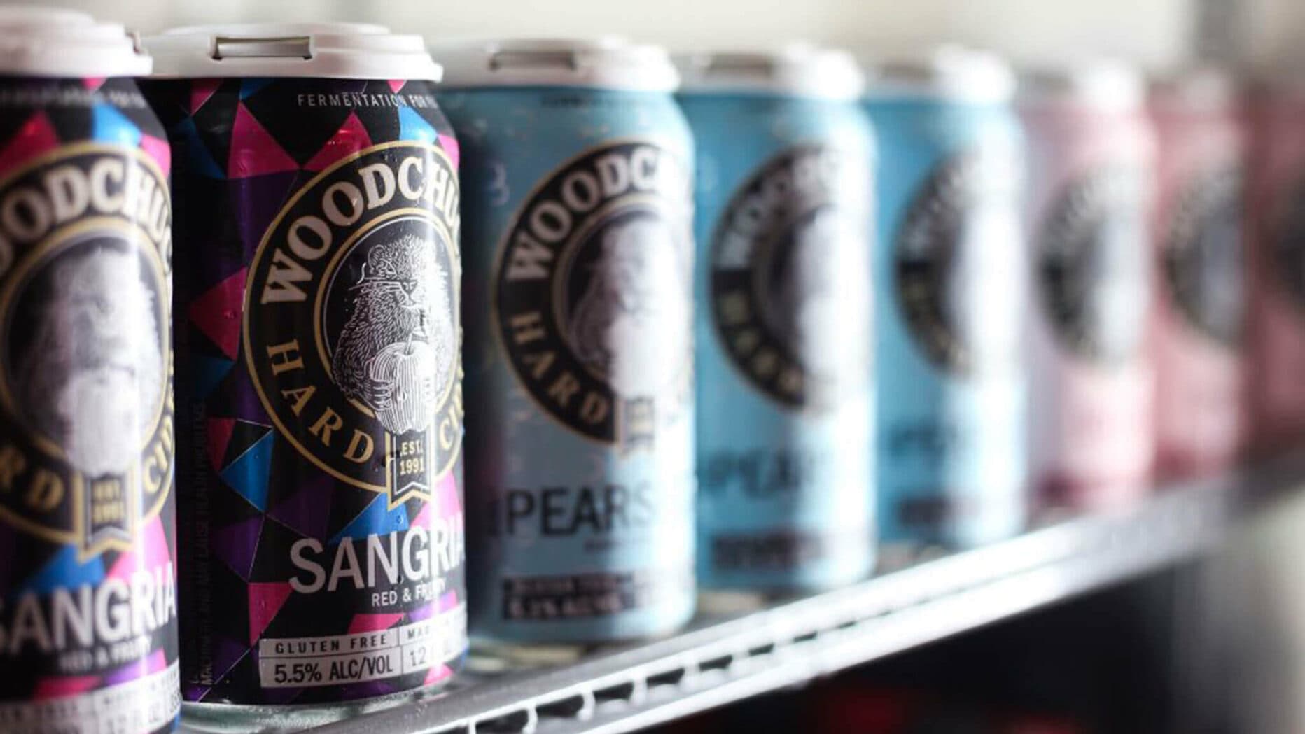
Sprout began by studying Woodchuck’s history, visual evolution, and consumer perception. Together with Amalgam, we reintroduced Chuck using a bold woodcut illustration style that honored Vermont’s craftsmanship while giving the mascot new personality and energy. Staying true to his roots, Chuck holds an apple—the brand’s core ingredient—while shadows and highlights give him a mischievous, confident, and distinctly modern look.
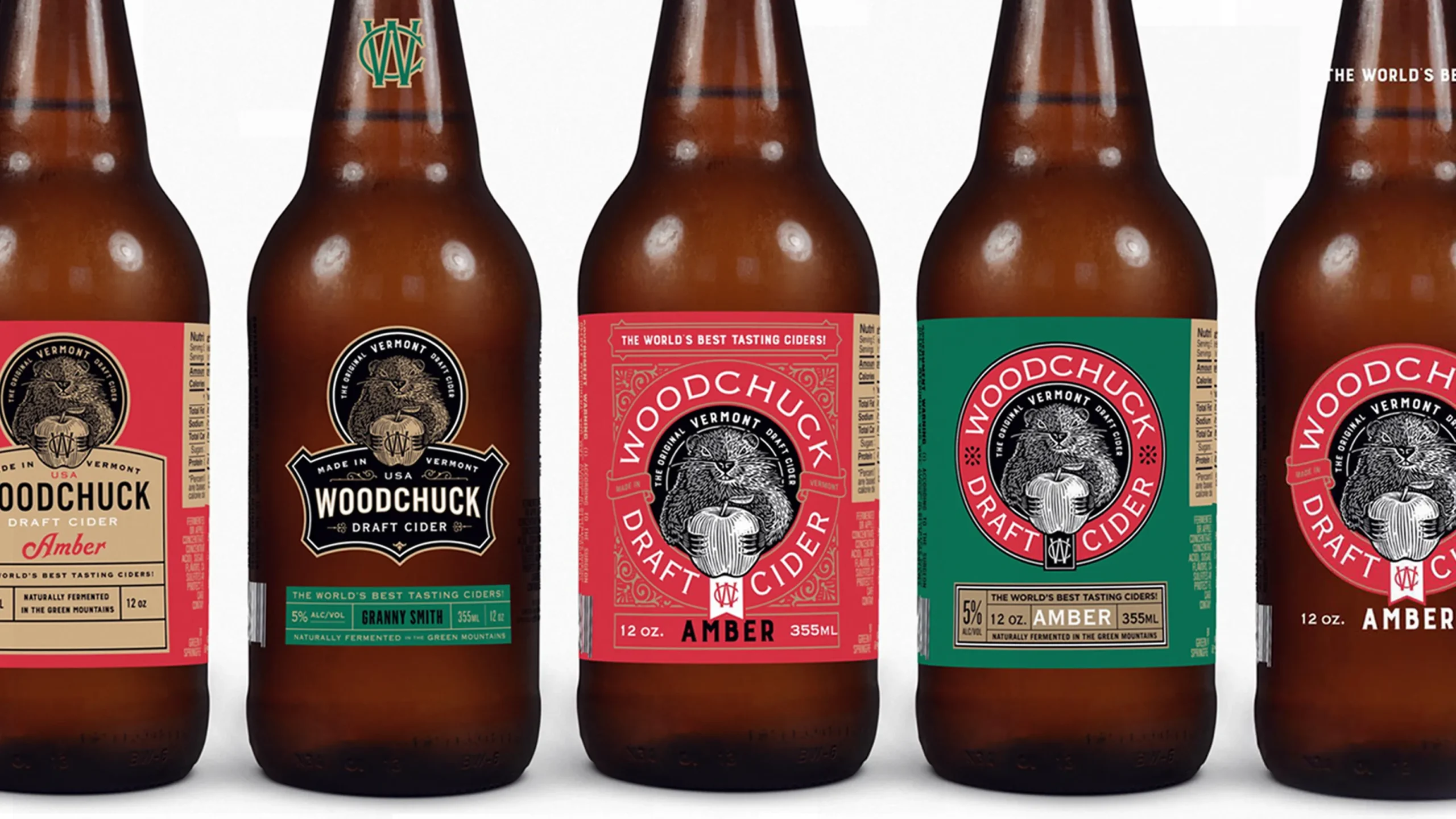
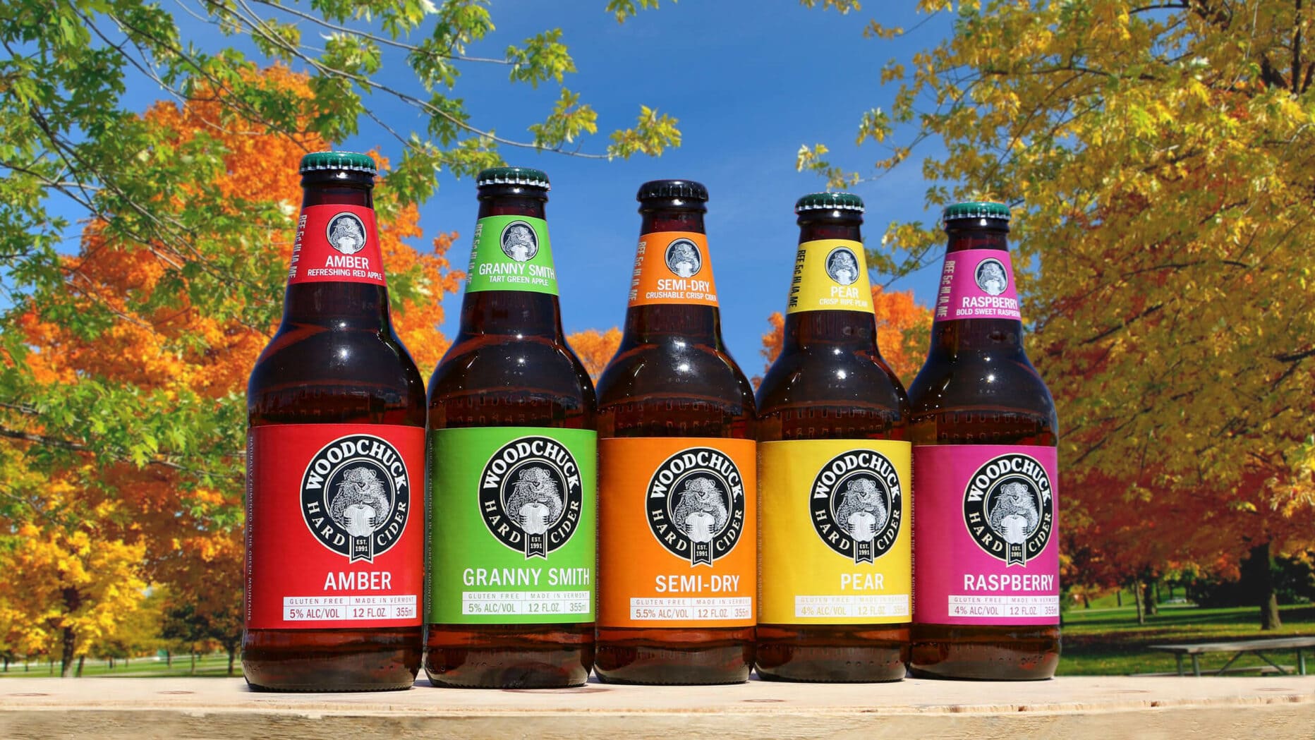
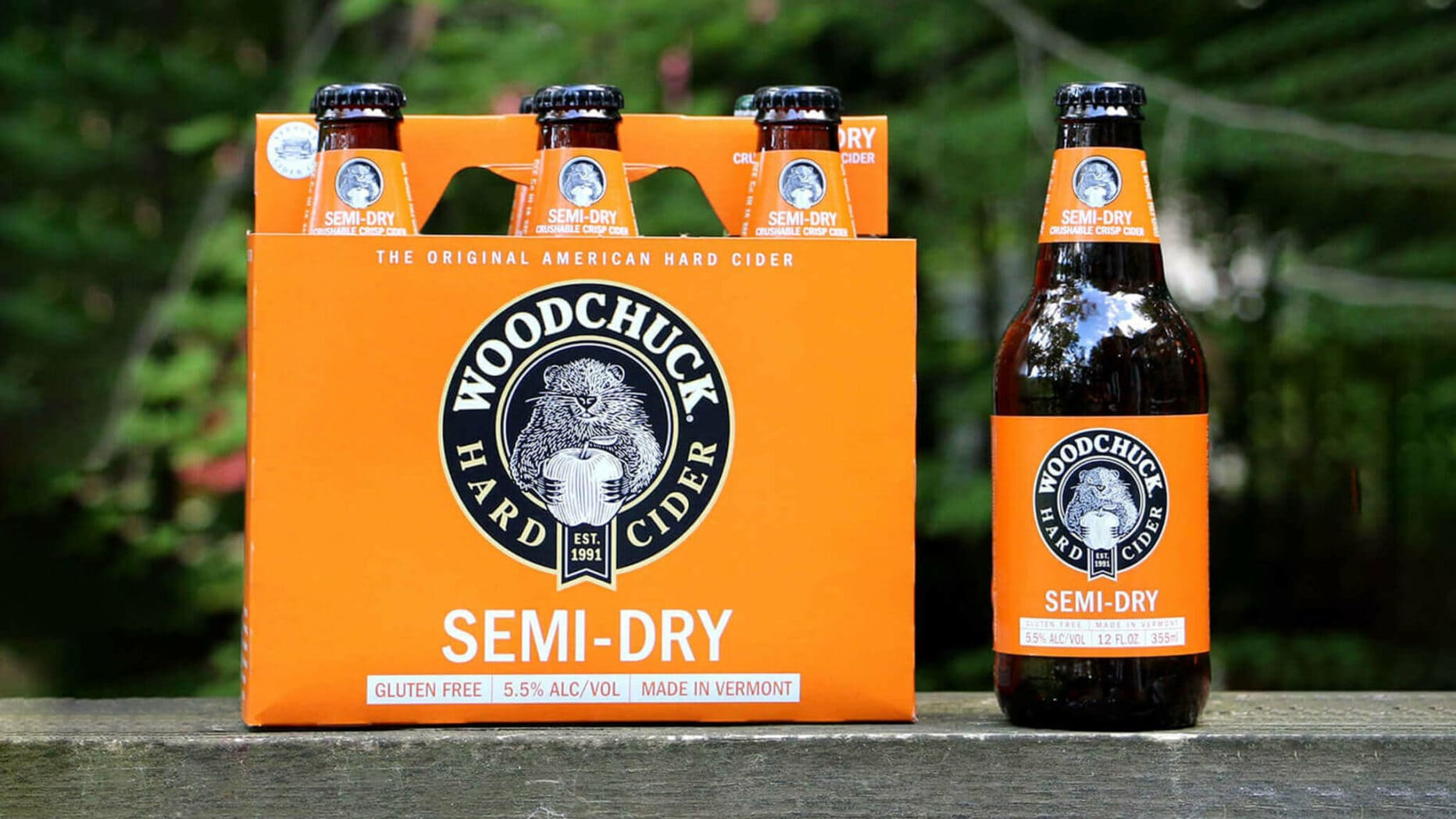
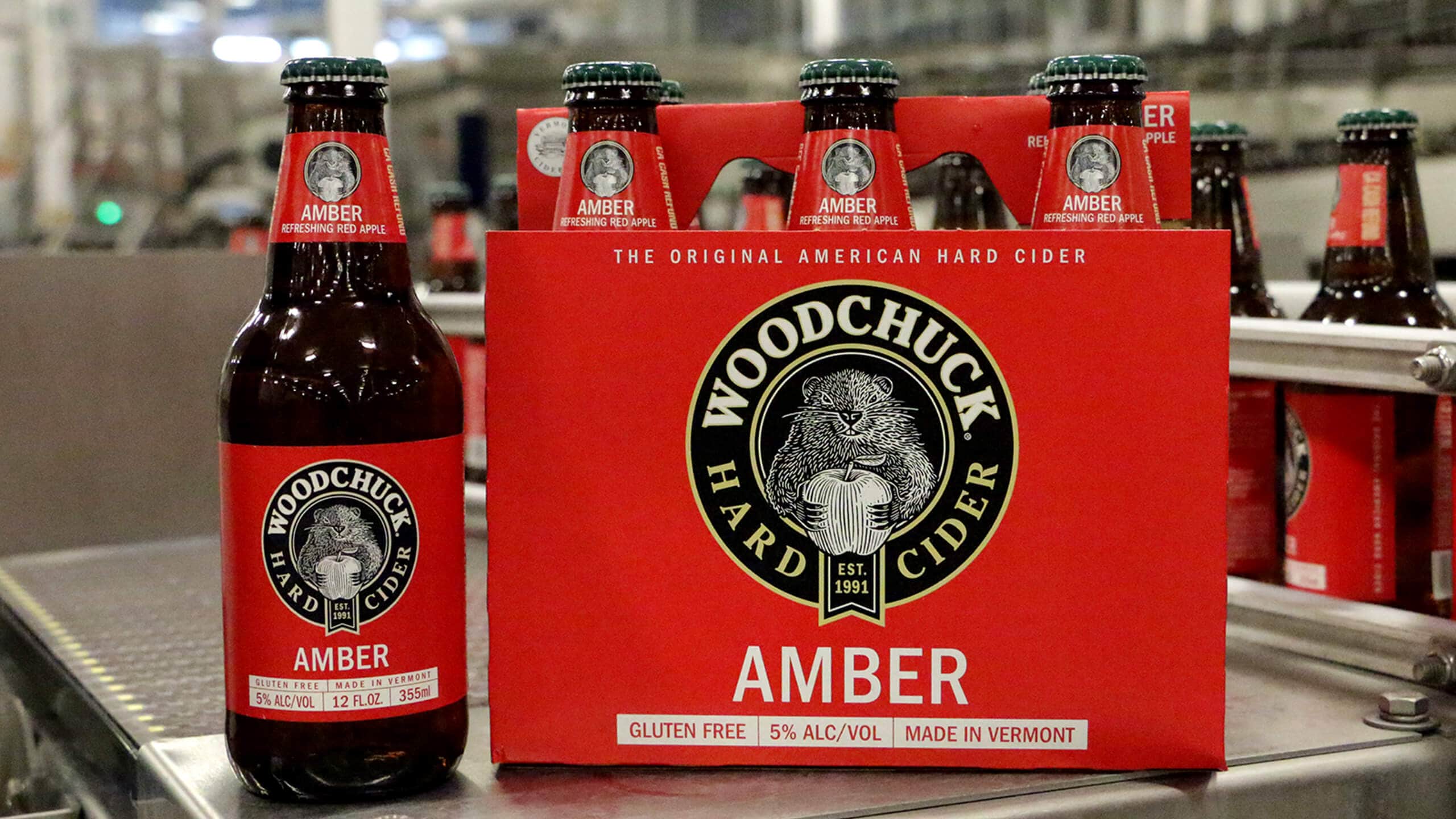
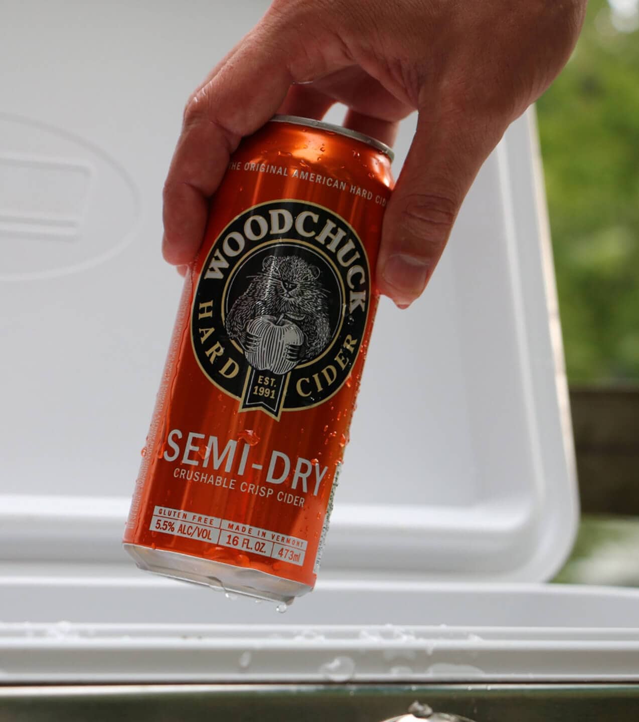
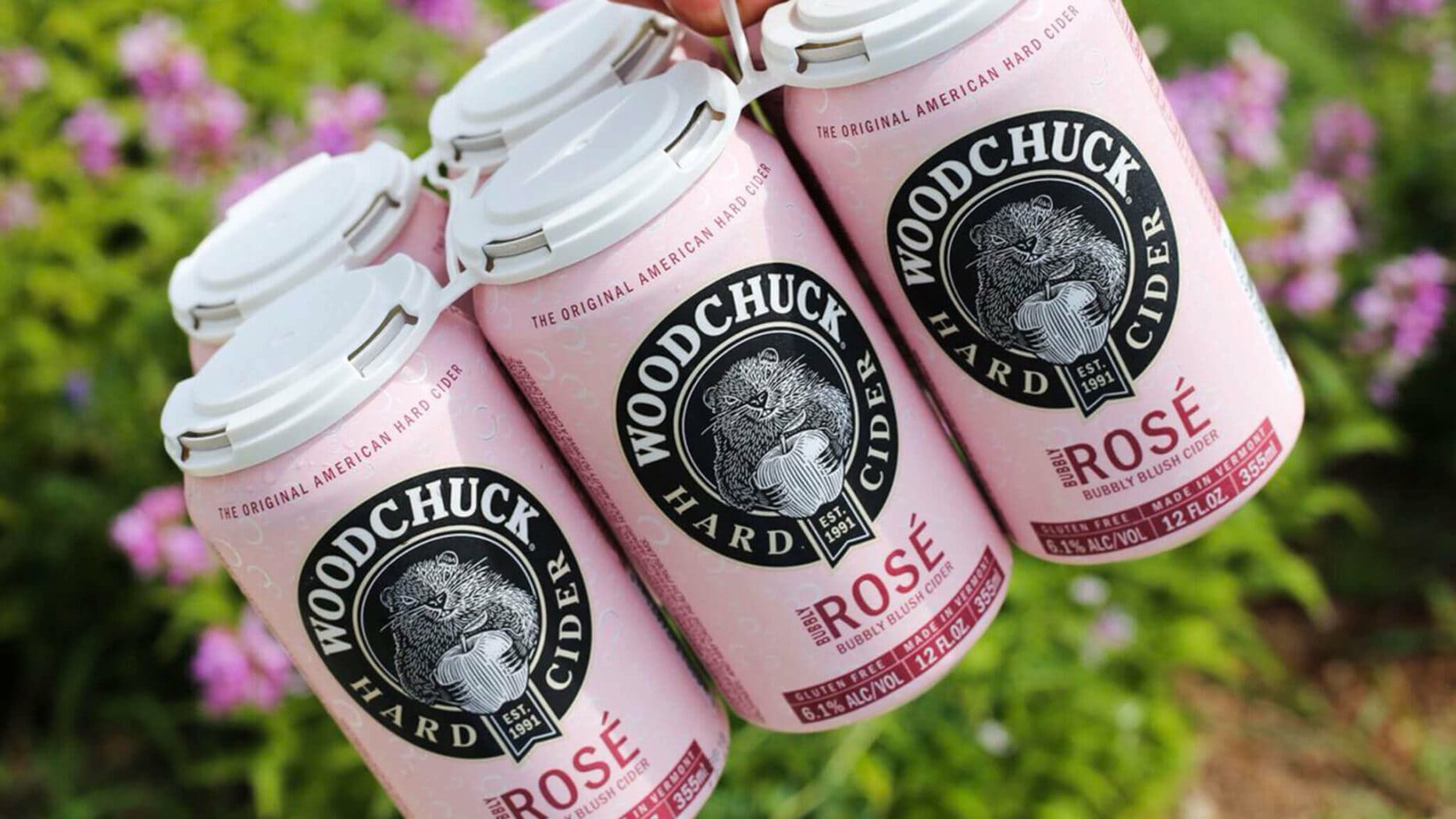
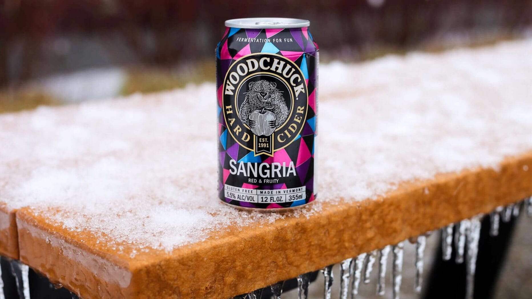
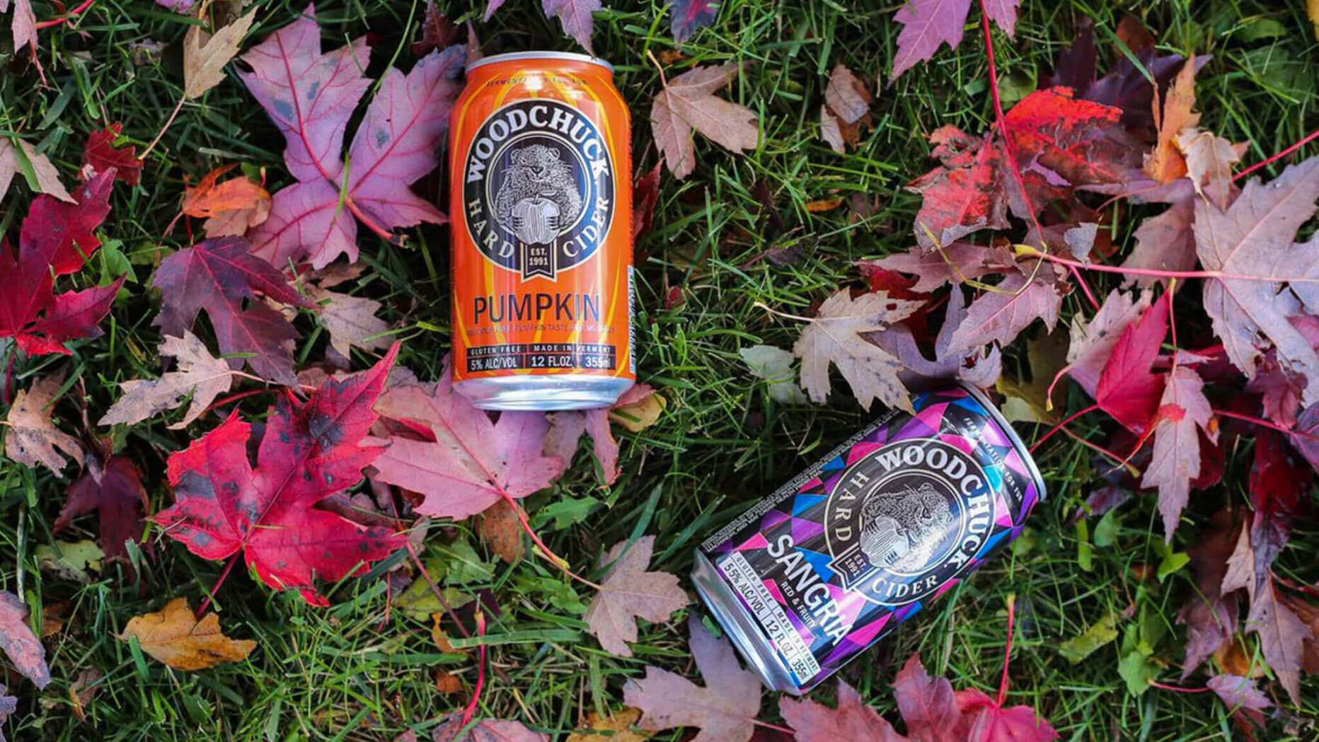
A Scalable System for Growth
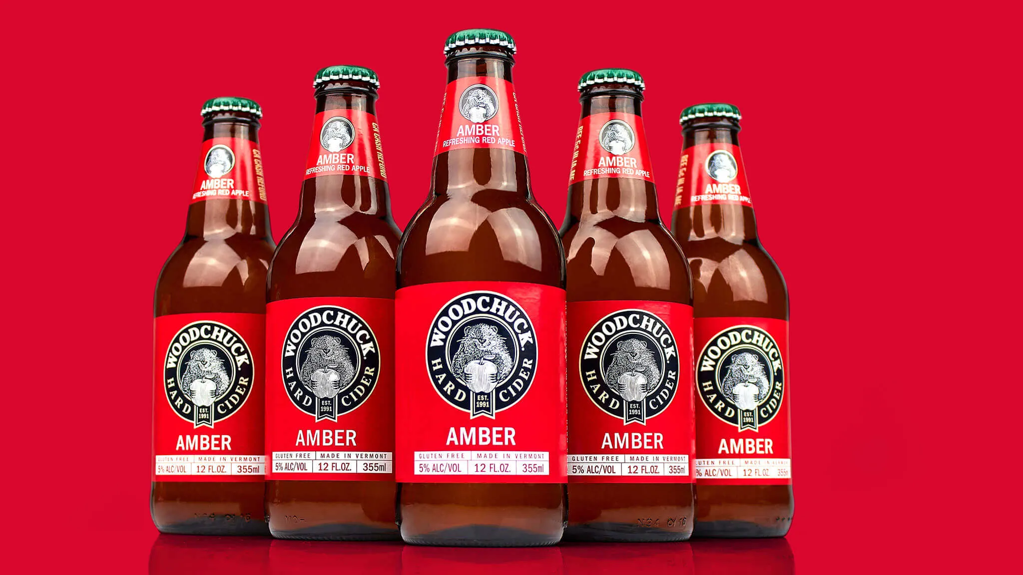
To ensure consistency and flexibility across the portfolio, Sprout established a clear packaging architecture anchored by a central round lockup. This framework provided recognition at shelf while allowing easy customization through color, pattern, and cider name—accommodating five core varieties and extending seamlessly to seasonal and limited-edition offerings.
The refreshed system balanced tradition and modernity: Chuck’s return evoked nostalgia for longtime fans, while the updated design aesthetic appealed to new consumers seeking authenticity and craft.
/ Woodchuck: The Outcome
From Throwback to Comeback
The visual refresh propelled Woodchuck back into the spotlight. Following the rebrand, the company saw immediate gains in both sales and market share, regaining relevance in a category where it had once been the pioneer.
Beyond short-term impact, the new identity unlocked long-term opportunities. The scalable design system enabled Woodchuck to introduce innovative seasonal flavors and limited-edition series without diluting brand equity. Each release feels fresh yet unmistakably Woodchuck, reinforcing the brand’s position as modern, approachable, and rooted in authentic Vermont tradition.
By bringing Chuck back with a revitalized personality and building a cohesive, flexible design language, Sprout helped Woodchuck reestablish its identity, strengthen consumer connection, and secure a differentiated position in an increasingly competitive market.
-
Love the aesthetic! Keep on keepin’ on Chucks!
&