fbpx

Our Pot-folio: A Roll-up of Our Work in the Cannabis Industry

There’s no business like grow business! Cannabis is a $2 billion dollar industry in our home state of Massachusetts alone. As legalization has spread across the country, so has the demand for design services in the cannabis market. From product to packaging design, identity development to environmental displays, over the last few years our design team has enjoyed working on a variety of projects. 

In celebration of 4/20, we’re sharing a look at our pot-folio: a roll-up of our work in the cannabis industry.
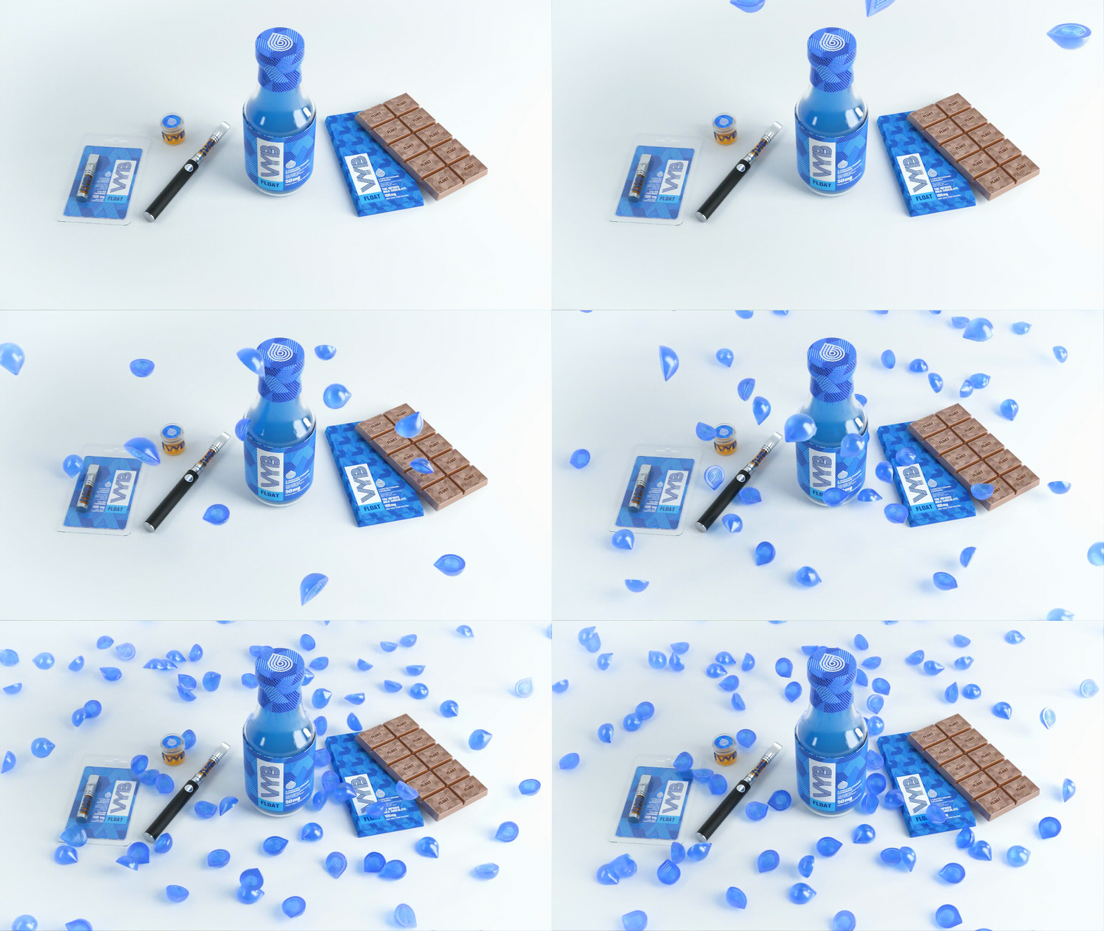
VYB

Branding ● Packaging

In our first project in the cannabis space, the Sprout team worked with VYB to generate a brand and packaging system for the line of beverages, edibles and concentrates. The VYB product offering focuses on four different effects that each target a different physical and psychoactive benefit. We designed a black and white brand that becomes saturated with color when associated with each effect, and developed a name for each to signal the benefit it provides. Consumers choose between their desired effect — Boost, Peak, Float or Fade — for a truly curated cannabis experience. Read more.

commcan cannabis flower packaging on grey background

CommCan

Packaging ● Digital ● Strategy ● Branding

In a joint effort with CommCan, Sprout developed an identity and packaging system for the Massachusetts-based dispensary. The logomark we created is simple, clean, and confident. Extending the aesthetics of the identity into our packaging design, we honed in on a sleek, refined form that celebrates the cannabis flower within. Color deliberately differentiates Sativa, Indica, or Hybrid strains, supporting a seamless and straight-forward customer shopping experience. Read more

After finding success in-house, CommCan sought to branch out. Sprout was enlisted once again to cultivate a go-to-market strategy for CommCan-developed edibles, beverages, and oil-based formulations. While the three sub-brands share an aesthetic and a POV — anchored by their simple, direct brand names: Drip, Bite, and Sip — each have their own retail voice.

Drip packaging color spread

Drip

Branding ● Packaging

Drip is a line of CO2 extracted cannabis oils produced exclusively by CommCan at its 60,000 sq. ft. cultivation facility in Medway, MA. We created a fun and vibrant aesthetic for the brand and a 4-color packaging system to represent each strain type. Read more.

CommCan Bite Edibles chocolate bars packaging

Bite

Branding ● Packaging ● Strategy

The Bite brand includes cannabis-infused edibles and baked goods. We aimed to create a handcrafted aesthetic, and used illustrations and scripted logotype to give the edibles a bespoke feel. Continuing the usage of color to differentiate product type, color was used to denote each flavor offering so that customers can easily find the taste they are looking for. Read more.

SIP cannabis infused soda for CommCan designed by Sprout Studios

SIP

Branding ● Packaging

CommCan asked for a comic book, graphic-inspired brand identity for their collection of bubbly bevs, SIP.  We designed a vibrant logotype embedded into a comic book speech bubble and packaged the bottles of pop with bright, saturated color schemes that signal each flavor profile. Further honing the aesthetic, the collateral is textured with a half-tone pattern similar to the pages of your favorite comic. Read more.

THC Pre-Roll Packaging

The Heirloom Collective

Branding ● Packaging ● Strategy ● Digital ● Environmental

Sprout created the branding strategy for a budding chain of dispensaries throughout MA. After multiple brainstorms, we arrived at the name: The Heirloom Collective aka THC. We leveraged typography, patterning, and messaging applications to position the company as a premium and thoughtful regional dispensary leader. Comprehensive brand guidelines directed the application of the logo hierarchy across packaging, merchandise, and THC’s retail and digital environment. Read more.

White marijuana dispensary storefront AMP with branding graphics on windows

AMP

Branding ● Strategy

Atlantic Medicinal Partners, also known as AMP, came to Sprout to develop a refined brand for their first dispensary. AMP wanted to convey a sense of sophistication through a modern logomark with a minimalist color palette. With this info in mind, we created a brand where wordmark meets logotype, and ultimately generated a sleek reference to the cannabis leaf. Read more.

The AVA Weedsafe for cannabis safe-keeping

AVA

Product ● Digital ● Strategy ● Branding

With an increasing number of states legalizing marijuana, our designers sought to tackle the issue of child safe in-home storage. The product of internal incubation, AVA — named after our founder’s daughter who seems to get into everything — is an IoT-connected smart safe with motion, proximity, humidity, and temperature monitoring. With an integrated internal battery, USB-charging capabilities, and a security camera inside, AVA provides a safe storage solution for your valuables, including but not limited to cannabis. Read more.

Varna Tech Family of Products with Halo, Halo+ and +Tag

Varna Tech

Product ● Branding ● Packaging ● Strategy ● Digital

Years after developing AVA, we had an aha moment— instead of creating a separate container for storage, why not turn the most used storage container into a smart safe? We developed Varna Tech, a Sprout Labs company, and designed a smart lock that retrofits onto an every day Mason jar found in most household pantries. The Halo and the Halo+ provide analog and digital solutions for enhancing the experience and opportunity of a standard Mason jar. The proprietary Halo+ mobile app has a range of IoT functionality including Bluetooth connectivity, remote locking and unlocking, access permissions, content logging, usage history, device tracking, proximity alerts, and other programmable functions. Read more.

[mc4wp_form id=”8931″]