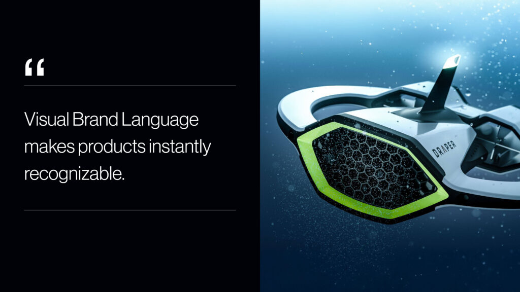
Visual Brand Language (VBL) is where design meets identity. It’s the strategic fusion of color, material, finish, form, and detail that transforms individual products into a unified brand experience. When executed thoughtfully, VBL creates products that are instantly recognizable, communicate your brand’s values, and foster deeper connections with customers. This powerful design approach ensures every product tells the same story—one that resonates clearly and consistently across markets and touchpoints.
As an industrial design and product design firm, Sprout Studios specializes in developing VBL strategies that help brands stand out and build lasting recognition. In this blog, we explore how design elements converge to create products that don’t just look good but become iconic extensions of your brand’s identity.
Designing Brand Recognition Through Product Form
Visual Brand Language (VBL) is the deliberate and strategic use of visual and tactile design elements that reflect a brand’s personality, values, and promises. While traditional branding centers on logos and messaging, VBL comes to life through the physical product itself — expressed in its shape, color, textures, and finishing details. In industrial design, Visual Brand Language is what ensures a product is recognizable as part of a brand family even before a logo is visible.
Our approach as an industrial design studio starts with deep collaboration and immersive research. We dive into your brand’s story, values, and market position to uncover the essence that should be expressed physically. Our industrial design team then develops a cohesive design system that integrates form, color, material, finish, and detail with intention—ensuring each product feels like a natural and authentic extension of your brand family.
A successful VBL strategy goes beyond surface aesthetics. It’s about forging meaningful connections and crafting familiarity through intentional design. By balancing innovation with brand consistency, we ensure that while each product serves a unique function, they all speak the same visual language.
This strategic approach is what elevates individual products into a powerful, unified brand experience.
The Core Components of Visual Brand Language in Product Design
A strong Visual Brand Language is a complete product design system made up of interrelated elements that work together to communicate a brand’s identity across an entire product portfolio. In industrial design, these components define how a brand looks, feels, and is recognized—whether a customer is seeing the product for the first time or using it every day.
A complete Visual Brand Language system in product design typically includes the following core components:
Form and Proportion: The foundational shape and geometry of a product establish its personality and positioning within a brand family. Soft, rounded forms may suggest approachability and warmth, while sharp, angular edges convey precision or performance. Proportion—how different elements relate in scale—can signal luxury, utility, or efficiency. When applied consistently, form and proportion become a core part of a brand’s product design language across multiple SKUs and categories.
Linework and Surface Transitions: Details like chamfers, bevels, edge radii, and surface intersections guide the eye and shape the tactile experience. In industrial design, these transitions often become subtle brand signatures, communicating everything from technical sophistication to organic simplicity. The way surfaces break, blend, or intersect is a powerful tool in establishing a recognizable and repeatable design language system.
Color, Material, and Finish (CMF): CMF in industrial design plays a central role in how products are perceived emotionally and functionally. A signature color palette, material choice, or surface finish—matte versus gloss, metallic versus soft-touch—can define an entire brand. CMF decisions aren’t just decorative; they support performance (grip, durability, temperature, wear) while reinforcing brand identity through texture, contrast, and tone.
Graphic Elements and Typography: Integrated graphics—whether through screen printing, embossing, laser etching, or digital interfaces—reinforce brand identity when applied with intention. Typography, iconography, and labeling should complement the product’s physical form and reflect the brand’s voice, whether that’s bold and modern, minimal and refined, or technical and utilitarian. In a strong Visual Brand Language system, these elements feel inseparable from the product itself.
Interaction Cues: How users interact with a product—buttons, handles, touch points, hinges, and grips—should reflect the same design principles that guide its form and appearance. Clear, intuitive interaction design improves usability while reinforcing trust and brand consistency. When repeated across a product portfolio, these physical interaction patterns become part of the brand’s recognizable product design language.
Lighting and Display Integration: For connected products and electronics, lighting behavior, screen layouts, and interface animations are increasingly important expressions of brand identity. These dynamic elements should harmonize with the physical industrial design, ensuring that digital and physical touchpoints speak the same visual language and reinforce a cohesive brand experience.
Product Architecture and Modularity: Consistent internal architecture and modular components support both scalability and brand cohesion. Whether it’s shared internal platforms, repeatable component layouts, or swappable modules, structural consistency helps brands grow their product lines while maintaining a unified design language system. This approach also improves efficiency in engineering and manufacturing without sacrificing brand expression.
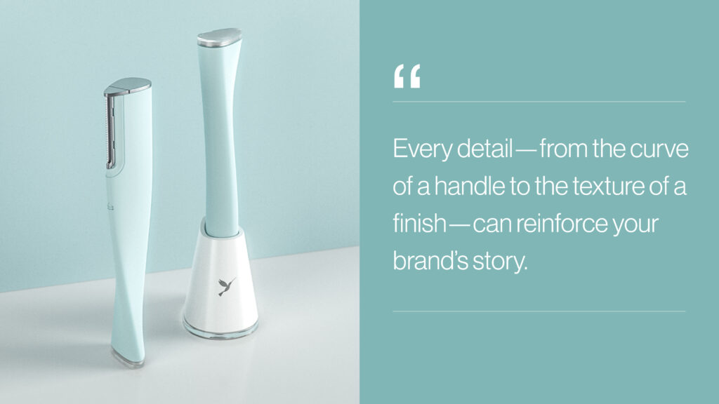
Together, these components create a visual and tactile vocabulary that customers begin to recognize and trust. When applied consistently, every design decision—from the curve of a handle to the placement of a logo—reinforces a clear and compelling brand identity across the product portfolio.
As a product design studio, we ensure each of these elements aligns with the broader goals of your brand’s Visual Brand Language and long-term product strategy.
Bringing Visual Brand Language to Life Across the Product Portfolio
Bringing a Visual Brand Language to life requires more than a design manual—it demands cross-functional collaboration and an iterative process that connects strategy to execution.
Building the Design System: Once the foundational VBL elements are defined, we build out a full design system tailored to the brand’s goals, category, and user experience. This system includes comprehensive guidelines that govern form, proportion, CMF, and key visual details. Successful implementation hinges on cross-functional alignment—VBL is only as strong as the teams who bring it to life. Involving marketing, brand, engineering, and product stakeholders early and often ensures that design intent is preserved and executed consistently across every touchpoint.
Designing Across Product Families: A strong VBL allows for both consistency and flexibility. Whether we’re designing an entire product line or a single hero SKU, we ensure each item feels unique in function but unmistakably part of a larger brand family. We consider product hierarchy, use cases, and customer interaction to fine-tune where elements should repeat and where variation adds value—guided by clear, repeatable design principles.
Prototyping and Refinement: Designing with VBL in mind doesn’t mean locking into a single solution. We prototype early and often—evaluating form, materials, interaction, and finish in real-world context. Testing with users allows us to validate the balance between brand expression and usability, and iterate toward the most emotionally resonant solution.
Manufacturing with Intent: Even the most well-crafted VBL can fall apart without executional alignment. That’s why we partner closely with engineering and manufacturing teams to carry the vision through production. We define tolerances, specify finishes, and ensure the smallest design cues aren’t lost during scale-up.
Future-Proofing the Brand: Design languages aren’t static. As brands evolve, so must their product expressions. We create systems that are adaptable—ready to expand into new product categories, technologies, or markets without losing their identity. This kind of forward-thinking VBL design sets the foundation for long-term brand equity and recognition.
Product Design Case Study: Sprout Studios x Draper
Draper, a Boston-based R&D powerhouse, pioneers technologies across space exploration, national defense, and healthcare. They engaged Sprout Studios to develop physical forms for three breakthrough concepts—unified under a new, future-facing Visual Brand Language.
Our product design team collaborated closely with Draper to translate each technology into a compelling physical product, while aligning with a shared brand identity rooted in trust, precision, and innovation.
- Microplastics Sensing UAV: Designed with enclosed thrusters for environmental sensitivity, this autonomous underwater drone maps microplastic contamination and transmits heat maps to the EPA. Its form conveys intelligence and ecological purpose.
- Mobile Thermoelectric Refrigerator: Engineered for global use in rugged conditions, this off-grid refrigerator pairs performance with a protective, robust exterior. Its design reflects durability, efficiency, and humanitarian impact.
- Immunotherapy Bioprocessing Device: A compact, user-friendly system for CAR-T cell therapy. We prioritized intuitive ergonomics and clean, clinical detailing to reflect the high-tech, life-saving nature of the process—while ensuring usability in lab environments.
These three products went on to earn significant acclaim, including placements on Fast Company’s World-Changing Ideas and TIME Magazine’s Best Inventions lists.
Following this success, our industrial design studio partnered with Draper to scale their VBL across future initiatives—hosting internal workshops and creating a comprehensive design system to ensure cohesive, future-ready execution.
This project is a real-world example of how Visual Brand Language in industrial design can unify radically different products under one coherent brand system.
Partner With Sprout to Build a Signature Look That Scales
When Visual Brand Language is executed well, it becomes more than a toolkit—it becomes a signature. Over time, customers begin to recognize your brand before they even see the logo. The silhouette of a product, the tactile feel of a finish, or the interaction pattern of a button can all signal that it belongs to your brand. That kind of recognition isn’t built overnight—it’s earned through consistency, intentionality, and great design.
If you’re looking to build a scalable product design system or define a Visual Brand Language for your brand, the right industrial design partner makes all the difference.
Sprout Studios can help you define, develop, and deploy a distinctive Visual Brand Language that transforms how your brand shows up in the world. Your brand has a story—let’s design the products that tell it. Click here to reach out to our industrial design team.