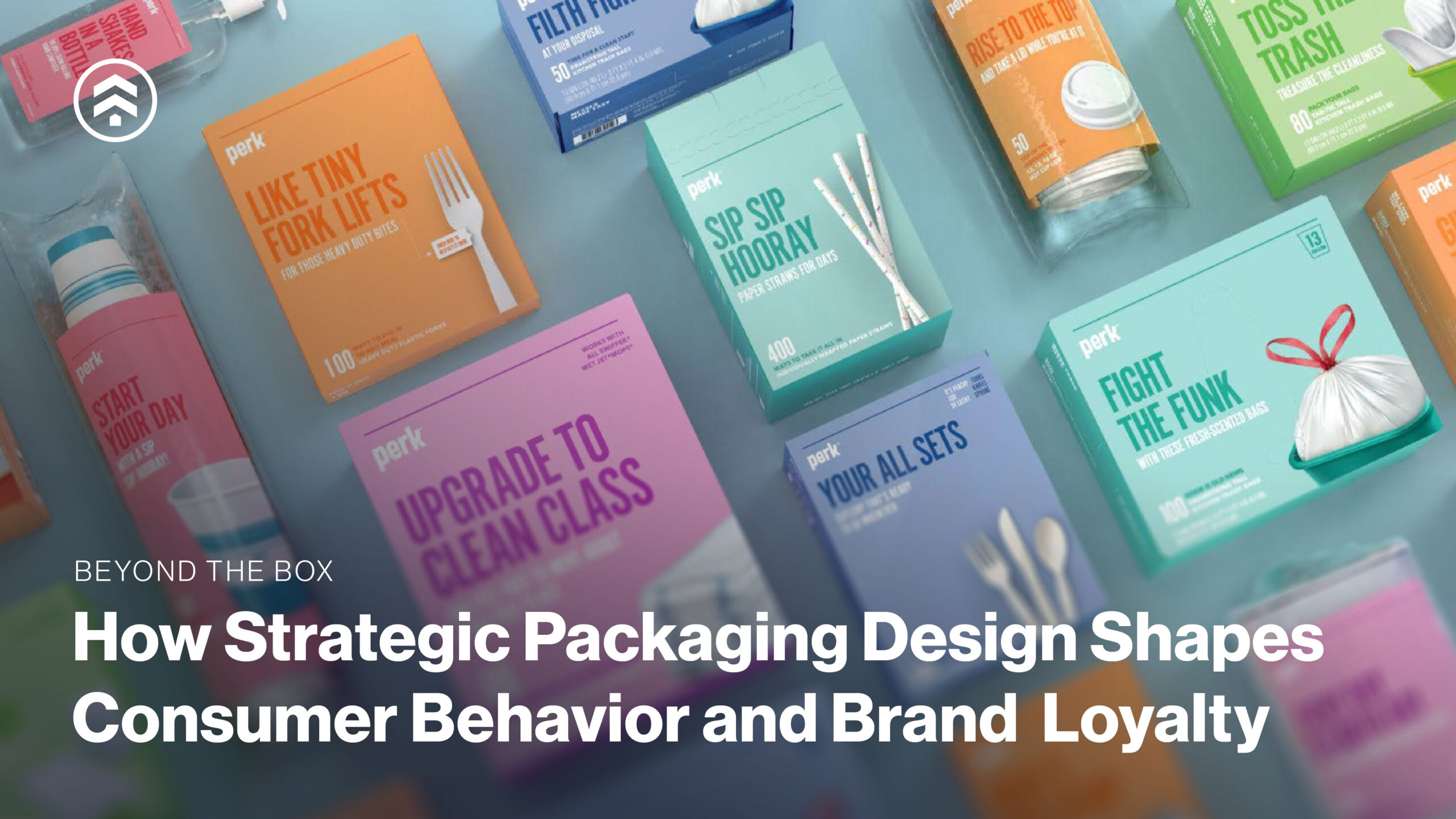
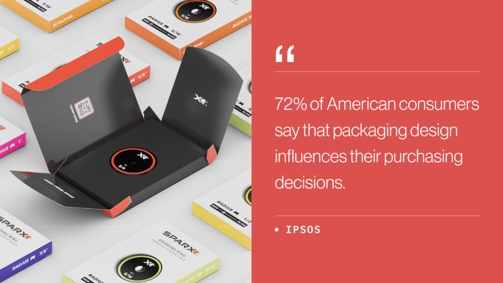
Packaging does more than look good on a shelf—it communicates your values, tells your brand story, and drives purchasing decisions. Research shows that 72% of American consumers say packaging influences what they buy, making it a strategic lever in your go-to-market plan.
At Sprout Studios, we treat packaging as an integral part of the product experience. By thoughtfully combining color, material, and finish (CMF), we design packaging that not only stands out visually but also reinforces brand identity and drives consumer behavior.
In this post, we’ll explore how color psychology, material selection, and tactile design can elevate packaging from simple containment to a strategic tool that creates memorable first impressions and lasting brand loyalty.
Why Packaging Design Matters
Effective packaging blends form and function, capturing attention while delivering a tactile and emotional experience. Whether launching a new product or refreshing an existing line, packaging is one of the most impactful tools for:
- Differentiating your product on-shelf or online
- Conveying brand values and positioning
- Reinforcing quality and credibility
- Driving purchase decisions and repeat sales
Every detail impacts how your product is perceived and performs in the marketplace.
Color Psychology in Packaging Design: The Visual Language of Branding
Color is one of the most powerful elements in packaging design. Beyond aesthetics, color communicates emotion, shapes perception, and signals your brand personality before a consumer even interacts with the product. Each hue evokes specific feelings and can influence purchasing decisions by aligning with a brand’s values and messaging.
For example:
- Red: Conveys energy, urgency, and action—ideal for products that want to grab attention quickly or inspire impulse purchases.
- Blue: Promotes trust, reliability, and calm—commonly used for wellness, tech, or healthcare brands where confidence and stability matter.
- Green: Suggests eco-consciousness, natural origins, and health—effective for sustainable, organic, or plant-based products.
- Black & Gold: Signals luxury, sophistication, and premium quality—used to elevate perception and create a sense of exclusivity.
By understanding the psychological associations of color, brands can make intentional choices that reinforce their visual brand language (VBL) and connect with the target audience on an emotional level.
At Sprout, we help brands strategically select and combine colors so that packaging not only stands out on the shelf but also creates an immediate impression that supports overall brand storytelling.
Packaging Materials: Driving Perception and Experience
Today’s consumers care about what packaging is made of just as mucMaterial choice is not only a logistical or cost decision—it’s a brand statement. Consumers evaluate a product as much by what it’s made of as by how it looks, making materials a strategic lever that influences perception, purchase behavior, and emotional connection.
Sustainability is an important consideration, with options like recyclable substrates, post-consumer recycled content, and plant-based alternatives allowing brands to meet eco-conscious expectations without compromising quality or brand positioning.
Beyond sustainability, materials shape perceived value and the overall sensory experience. A rigid, textured box signals premium craftsmanship, while a lightweight, flexible pouch conveys portability and convenience. Thoughtful material selection also enhances the unboxing experience, reinforces brand storytelling, and strengthens consumer engagement, turning each touchpoint into a meaningful interaction.
Texture and Tactility: Packaging Designed for the Senses
Packaging is a multisensory experience, and touch plays a critical role in how consumers perceive a product. Texture and tactility are core components of a CMF strategy in packaging design, allowing brands to reinforce identity, convey quality, and create memorable interactions that extend beyond the visual.
Thoughtful tactile design reinforces brand personality:
- Soft-touch matte: Elegant, restrained, premium
- Rough, uncoated textures: Handcrafted, authentic
- Glossy finishes: Bold, energetic, attention-grabbing
Integrating tactile elements into packaging design also enhances unboxing experiences, encouraging repeat engagement and brand loyalty. When combined with strategic color choices and material selection, tactile design becomes a powerful tool to reinforce brand personality, signal product value, and shape consumer behavior.
At Sprout Studios, we approach tactility with intention, ensuring every texture and finish aligns with your CMF strategy and overall brand vision, turning ordinary packaging into an experiential touchpoint.
Packaging That Performs, On-Shelf and In-Hand
Exceptional packaging lives at the intersection of branding, engineering, and consumer psychology. Every choice in color, material, and finish (CMF) is a deliberate tool to influence perception, enhance usability, and reinforce your brand’s identity. By aligning form, color, and tactile elements with your brand vision, we create packaging that not only stands out on the shelf but also engages consumers from the very first touch.
Our product packaging design services include:
- Structural packaging design – optimizing form and functionality for shelf presence, ease of handling, and durability, with material choices that reinforce perceived quality.
- Visual brand language development – cohesive color palettes, finishes, and graphic elements that ensure instant brand recognition and support your broader CMF strategy.
- Unboxing experience design – tactile finishes, textures, and interactive elements that delight consumers, turning every unboxing into a memorable, brand-driven moment.
- Packaging graphics design – typography, hierarchy, and messaging integrated with CMF cues to communicate brand values and guide attention.
- Sustainable materials research – strategic material selection that balances visual appeal, tactile experience, and eco-conscious innovation.
- Print and finish specification – finishes, coatings, and textures carefully chosen to reinforce premium perception and brand personality.
- Prototyping and vendor handoff – ensuring packaging performs visually and functionally with production-ready solutions.
By leveraging a strategic CMF approach, Sprout ensures that your packaging does more than look good—it drives consumer behavior, strengthens brand perception, and delivers a cohesive, memorable experience both on-shelf and in-hand.
Ready to Elevate Your Product Packaging Design?
Your packaging should do more than look good—it should strategically leverage color, material, and finish (CMF) to shape perception, reinforce brand identity, and drive consumer behavior. At Sprout Studios, we create packaging that combines visual impact, tactile experience, and functional excellence to deliver a cohesive, memorable brand experience.
Whether launching a new CPG brand or refreshing an existing line, let’s collaborate on packaging that performs. Reach out to our design team to get started.