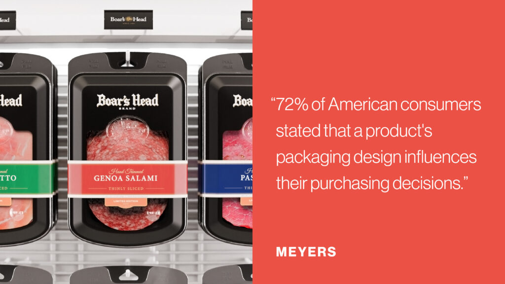
When consumers browse store aisles or scroll through online marketplaces, they’re faced with an overwhelming number of choices. In these moments, packaging design plays a decisive role, not only by grabbing attention, but by communicating brand values, signaling quality, and influencing purchasing decisions. More than just a container, packaging is a critical part of the product experience and a powerful tool for standing out in a crowded market.
Packaging design is the strategic use of structure, color, materials, graphics, and functionality to differentiate a product, communicate brand identity, and influence buying decisions at the point of sale.
At Sprout Studios, we view packaging as an extension of the product and the brand. In this article, we’ll explore how packaging design drives product differentiation and brand identity, and how thoughtful, user-centered packaging can improve engagement, recognition, and market success.
Packaging as the Silent Salesman
Packaging is often the first touchpoint between a consumer and a product, acting as a silent salesman on the shelf or screen. In just a few seconds, it must communicate what the product is, who it’s for, and why it’s worth choosing over competitors.
Effective packaging design:
- Grabs attention in crowded retail and digital environments
- Communicates key benefits and brand positioning quickly
- Builds trust through clarity, consistency, and quality cues
- Encourages interaction and consideration
Because many purchasing decisions are made in moments, packaging must work fast. A strong first impression can be the difference between being noticed, or being overlooked entirely.
Crafting a Strong Brand Identity Through Packaging Design
Packaging plays a central role in defining and reinforcing a brand’s identity, visually representing its personality, values, and differentiating features. Through cohesive and thoughtful design, packaging can strengthen brand identity across various consumer touchpoints, creating a consistent and memorable experience.
Visual Consistency and Brand Recognition
Elements like logos, typography, color palettes, and imagery are foundational to brand identity. When these elements are thoughtfully integrated into packaging design, they build brand recognition and familiarity.
Think of the red-and-white Coca-Cola design or the sleek minimalism of Apple’s packaging. These visual cues become ingrained in the consumer’s mind, making the brand instantly recognizable in any environment.
Maintaining consistency in packaging across a product line reinforces a unified brand presence, fostering customer trust and familiarity over time. The more quickly consumers associate a product’s packaging with a particular brand, the stronger the connection becomes.
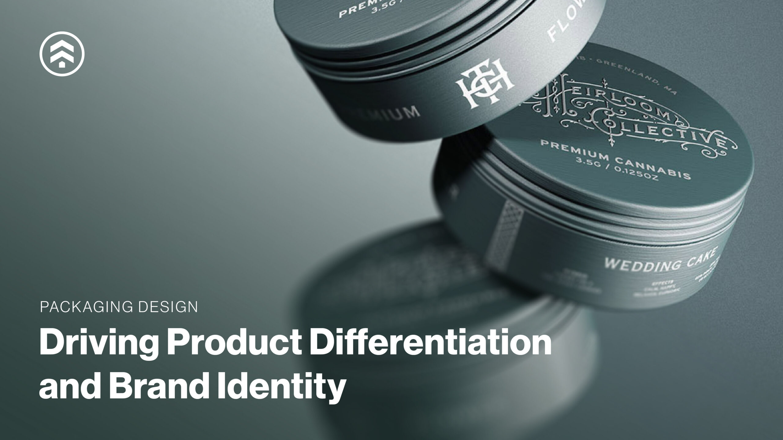
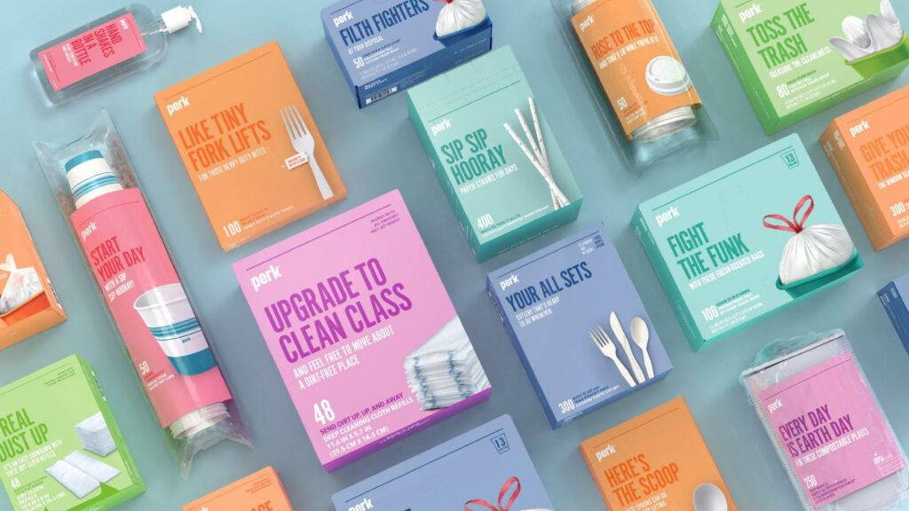
Differentiation in a Saturated Market
Packaging design is one of the most powerful tools for product differentiation. Whether through innovative structures, bold colors, or creative use of materials, effective packaging communicates what makes a product unique.
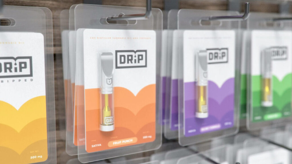
For example, skincare brands often use clean, minimal packaging to suggest purity and efficacy, while energy drinks lean into bold colors and dynamic forms to convey energy and performance. The visual language of the package should align with the product’s promise and resonate with its target audience.
Emotional Appeal and Storytelling
Great packaging doesn’t just inform, it connects. Design choices can evoke emotions like trust, excitement, nostalgia, or luxury, helping build deeper relationships with consumers.
Storytelling through packaging might include:
- Illustrations that reference brand heritage
- Materials that communicate sustainability values
- Visual cues that hint at craftsmanship or innovation
Even subtle details can strengthen emotional connection and reinforce what the brand stands for.
Key Considerations When Designing Packaging for Differentiation and Brand Identity
Designing effective packaging requires a balance of creativity and strategy. Every decision, from color to structure, should support both differentiation and brand clarity.
Strategic Use of Color
Color has a profound impact on consumer behavior and perception. It can evoke specific emotions and associations, capture attention and influence purchasing decisions. For example, warm colors like reds and oranges can drive attention and action in food or OTC products. In contrast, calming hues like blue and green are often linked to trust, wellness, and serenity, making them ideal for healthcare and tech brands.
Understanding these color associations allows brands to elicit the right emotions from their target audience. Tylenol’s iconic red packaging is a great example: it stands out on shelf while reinforcing brand recognition and reliability. The right color strategy should both differentiate the product and reinforce brand positioning.
Typography and Visual Hierarchy
Typography guides the eye and helps consumers quickly understand what matters most. A clear visual hierarchy ensures the product name, key benefits, and differentiators are easy to find and easy to read.
Whether a brand uses expressive or minimal type, the goal is the same: clarity, usability, and strong communication at a glance.
Material Choices and Sustainability
Material selection affects both perception and performance. As sustainability becomes increasingly important, packaging materials can serve as a powerful differentiator. From reducing material waste to using biodegradable or recyclable alternatives, sustainable packaging communicates a brand’s values and appeals to environmentally-conscious buyers.
Tactile qualities of materials also affect how a product is perceived. A premium product may use sturdy, matte-finish packaging to signal quality and durability, while lighter, simpler materials may convey economy or functionality.
Innovation in Structure and Form
Innovative structure and thoughtful functionality can truly set packaging apart. Unconventional shapes, hidden compartments, and built-in features can surprise and delight consumers, creating memorable and engaging experiences. Examples include packages that transform into reusable items, incorporate easy-pour spouts, or fold for compact storage. These structural elements not only enhance usability but also communicate a brand’s values. A collapsible, space-saving design may emphasize modernity and practicality, while a multi-layered, premium structure evokes opulence and sophistication.
Functionality is just as important as aesthetics. User-centric features—like resealable bags, ergonomic handles, or airless pumps—enhance convenience and satisfaction. When form and function work together, packaging stands out visually, improves usability, and reinforces brand identity, leaving a lasting impression on consumers.
The Unboxing Experience
The unboxing experience has become a pivotal moment in the consumer journey, transforming packaging from a functional necessity into a tool for engagement and brand storytelling. A well-designed unboxing experience can generate excitement, create emotional connections, and even inspire user-generated content that amplifies a brand’s reach.
Memorable unboxing experiences often combine visual delight with tactile engagement. Elements like magnetic closures, elegant tissue, or layered reveals can surprise and engage the consumer, reinforcing the product’s perceived value.
By designing packaging that excites and engages from the moment it’s opened, brands can create lasting impressions, deepen consumer relationships, and turn a simple act into a powerful marketing tool.
What Makes Packaging Design Effective?
Effective packaging design is about more than aesthetics. It’s a strategic tool that communicates a product’s value, builds brand identity, and differentiates it in a crowded marketplace. Key elements of successful packaging include:
- Clear brand positioning and messaging – Packaging should instantly convey what the brand stands for and what makes the product unique. Consumers should understand the product’s promise at a glance.
- Strong visual hierarchy and readability – Essential information like product name, key features, and benefits should be immediately visible and easy to interpret. A well-organized layout guides the consumer’s eye and reduces decision friction.
- Strategic use of color, typography, and materials – Thoughtful design choices reinforce brand personality and influence consumer perception, helping the product stand out while aligning with brand values.
- Thoughtful structural and functional design – Innovative shapes, ergonomic features, and practical elements enhance usability while creating memorable experiences. Packaging should delight without sacrificing functionality.
- A user-centered, memorable opening experience – The unboxing moment can create emotional engagement, spark social sharing, and leave a lasting impression that deepens consumer loyalty.
When these elements work together harmoniously, packaging becomes a powerful driver of both product differentiation and brand identity, turning first impressions into lasting consumer relationships.
Packaging Design for Brand Differentiation
While the saying “don’t judge a book by its cover” may be good advice in life, in retail, the cover often makes all the difference. Packaging design shapes first impressions, communicates value, and helps products stand out in competitive markets.
At Sprout Studios, we see the crowded marketplace as an opportunity for smarter, more strategic design. Our packaging design work focuses on combining brand strategy, user experience, and creative problem-solving to create packaging systems that attract attention, reinforce identity, and support business goals.
Sprout Studios is a Boston-based design and innovation studio specializing in product packaging design, brand identity, and go-to-market packaging systems. If you’re looking to elevate your packaging and stand out on shelf or online, connect with our team to discuss your next project.