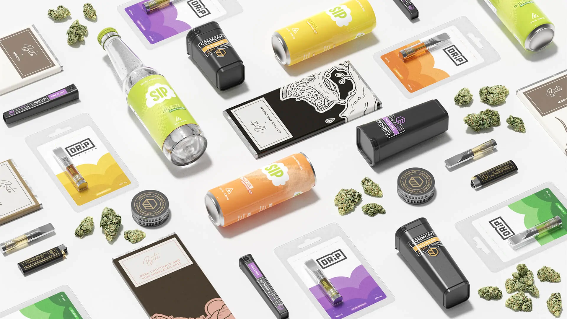
Brand Portfolio
Establishing an umbrella cannabis brand and a versatile subbrand portfolio.
/ Commcan: Intro
Commcan
Sprout worked with Commcan initially to develop a house brand for the Flower offer sold in their budding MA-based dispensary. The relationship evolved, alongside the growth of the cannabis market in the Commonwealth of Massachusetts, to include the development of a sub-brand strategy for new THC-based formulations in the Commcan portfolio. These sub-brands have well positioned Commcan for distribution throughout the state’s growing cannabis retail ecosystem.
/ Commcan: The Challenge
Stating the Understated
The cannabis industry is saturated with brands that lack sophistication, thoughtfulness, and/or merely flaunt imagery of cannabis leaves. We sought to create an identity that reflected the industrial integrity of the brand’s traditional, organic ingredients and its deeply scientific process. The logomark we created to advance these principles is simple, clean, and confident.
/ Commcan: The Approach
Merging Science and Nature
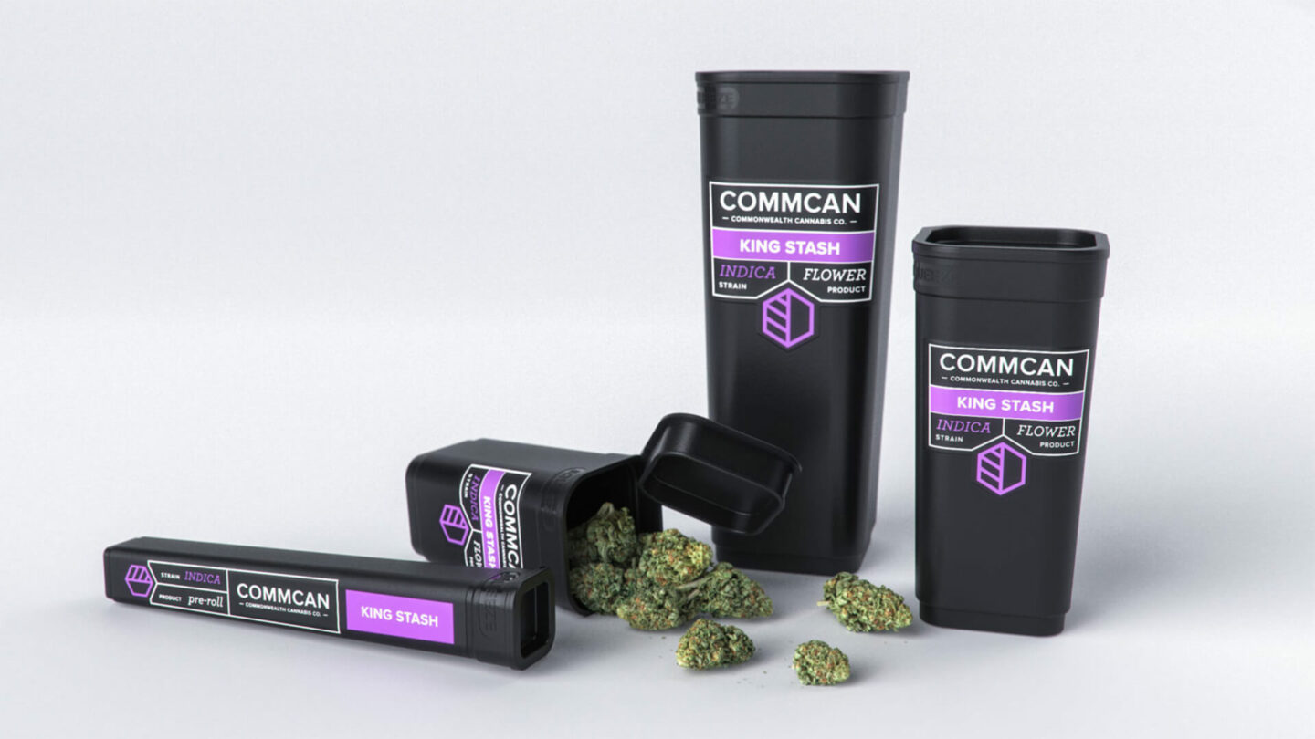
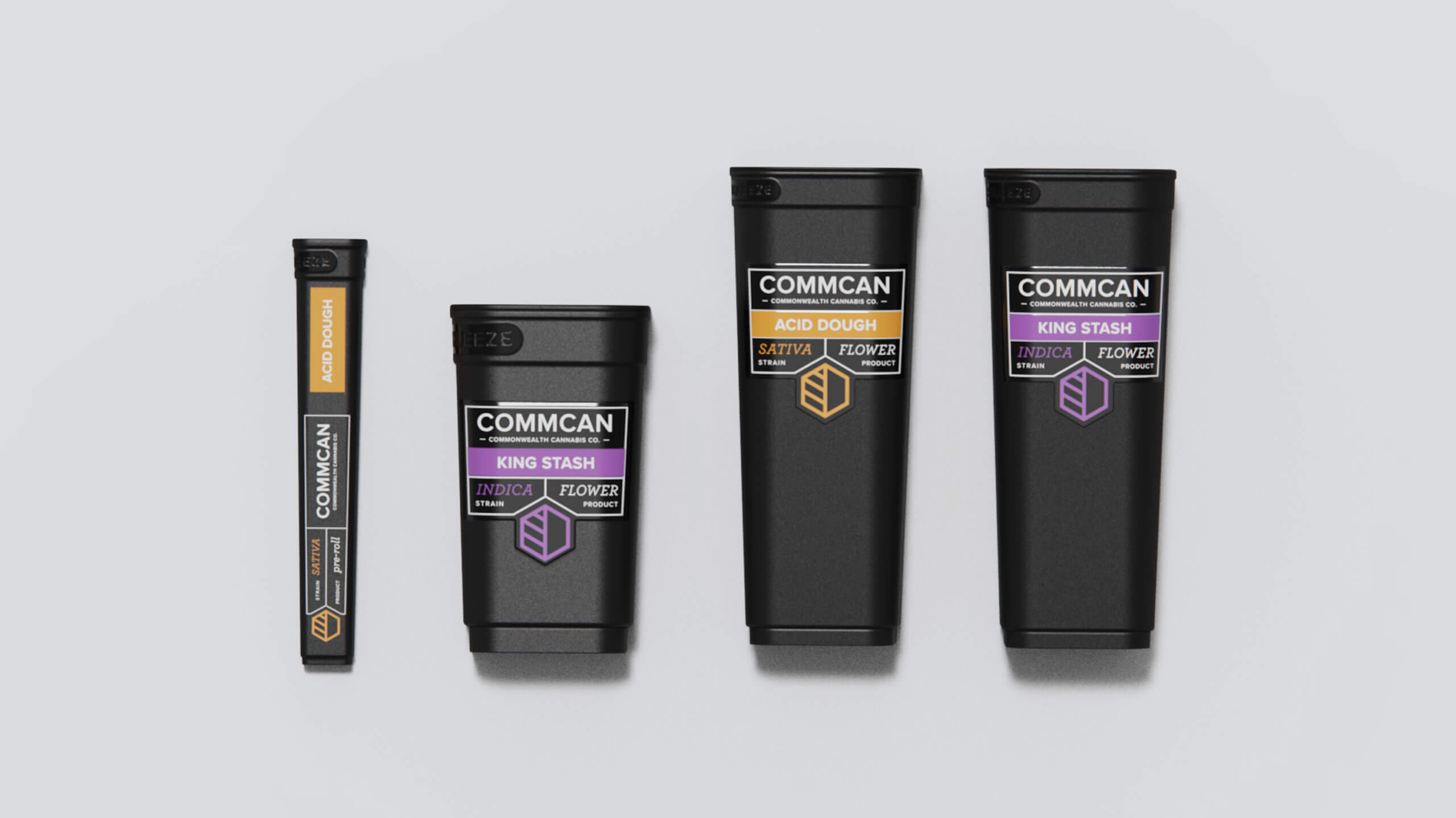
The Commcan mark consists of two main components—the frame and the content within. The frame provides a sense of strength and innovation, while its hexagonal form offers a subtle nod to the THC molecule. The vertical and diagonal lines within the frame create a simplified, geometric representation of the cannabis leaf. They work together in an understated way to acknowledge the scientific approach to cannabis cultivation that Commcan pursues. Sprout also developed packaging for Commcan Flower. Extending the aesthetics of the identity, we honed in on a sleek, refined form that celebrates the cannabis flower within. Color deliberately differentiates Sativa, Indica, or Hybrid strains, supporting a seamless and straight-forward customer shopping experience. The architecture was designed to engage the customer with the product while providing the key information they require to replenish a favorite or make a new discovery.

Branching Out
As the retail cannabis market grew in Massachusetts, Commcan asked Sprout to help it develop a marketing strategy for presenting Commcan products in the product mix of non-Commcan retailers. The business goal was to develop a product offer that could augment the product mix of those stores without competing with their house brands. The design objective was to create a branded offer, distinct from the Commcan brand, that could align new Commcan-developed edible, beverage, and oil-based formulations. The three subbrands based on this strategy give Commcan a platform for marketing its offer within any retail product mix. While the three sub-brands share an aesthetic and a POV—anchored by their simple, direct brand names: Bite, Sip, and Drip—each have their own retail voice.
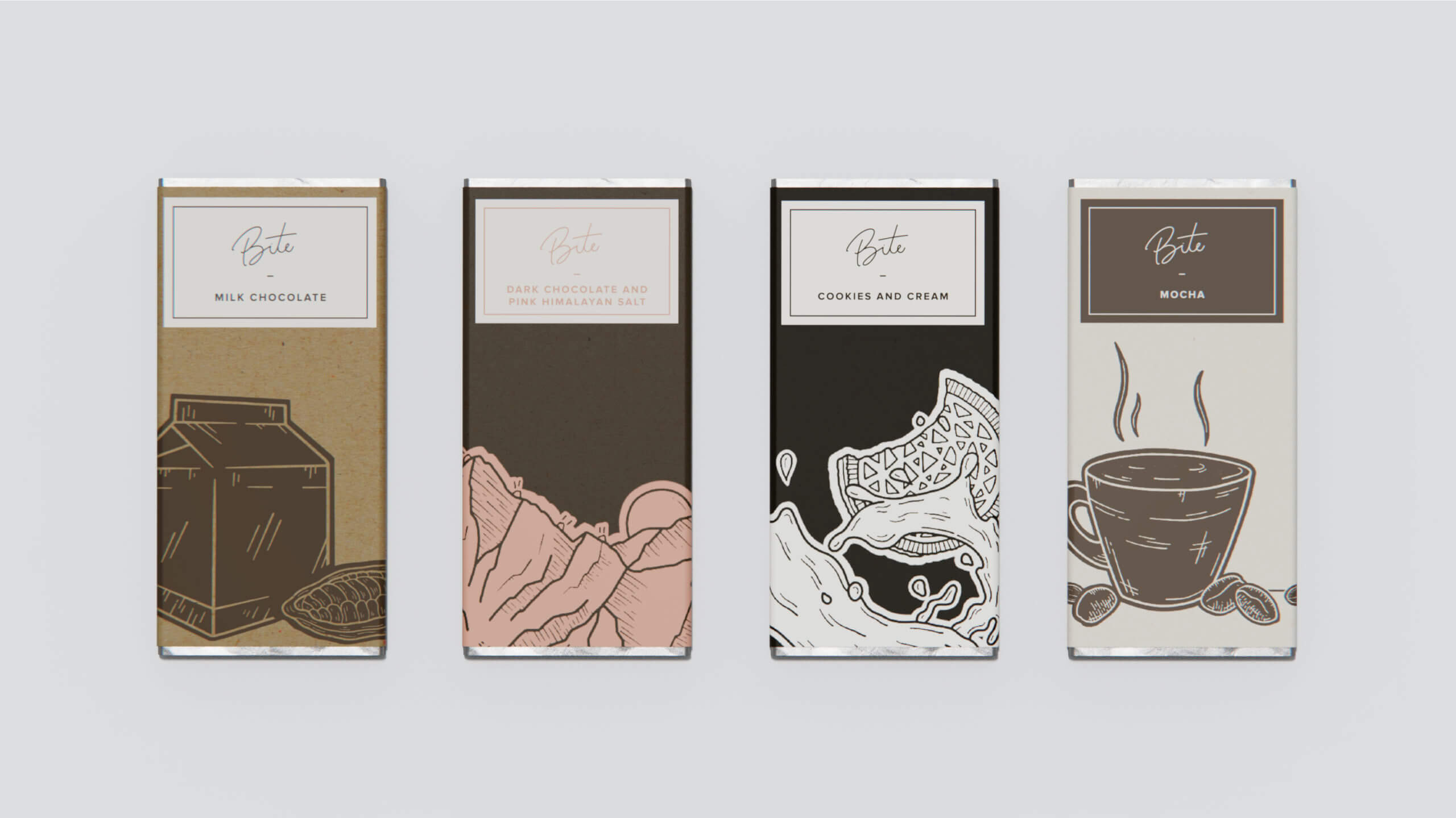
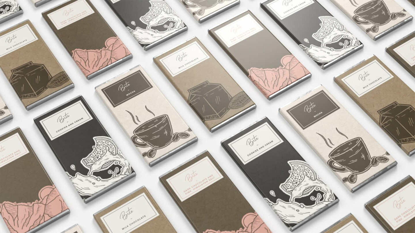
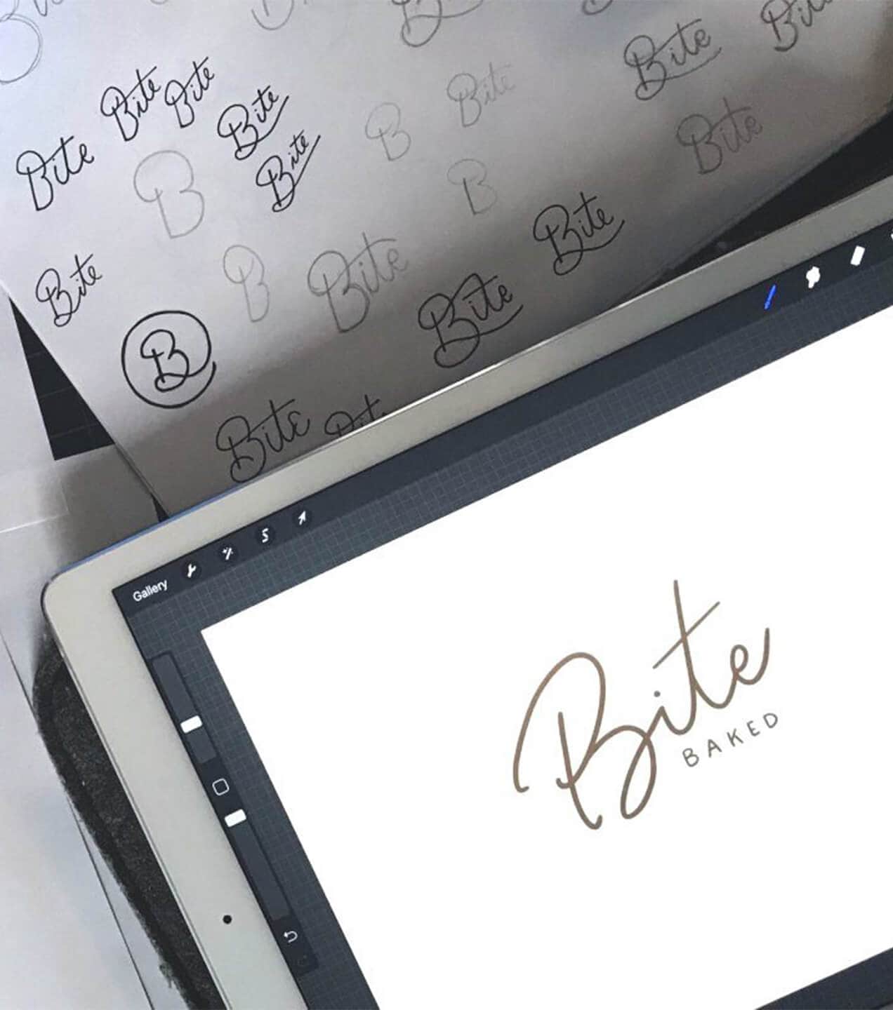
Bite – Sophisticated Sugars
Bite, the Commcan edibles subbrand, features a handcrafted aesthetic inspired by the visuals often used in bakeries. The thin-lined script of the logotype gives the brand a personal and approachable character. When paired with the illustrations, each bar has a one-of-a-kind, bespoke feel. The calm, gentle color palette evokes distinct flavor profiles, guiding customers to use visual sensation as a proxy for the taste they seek.
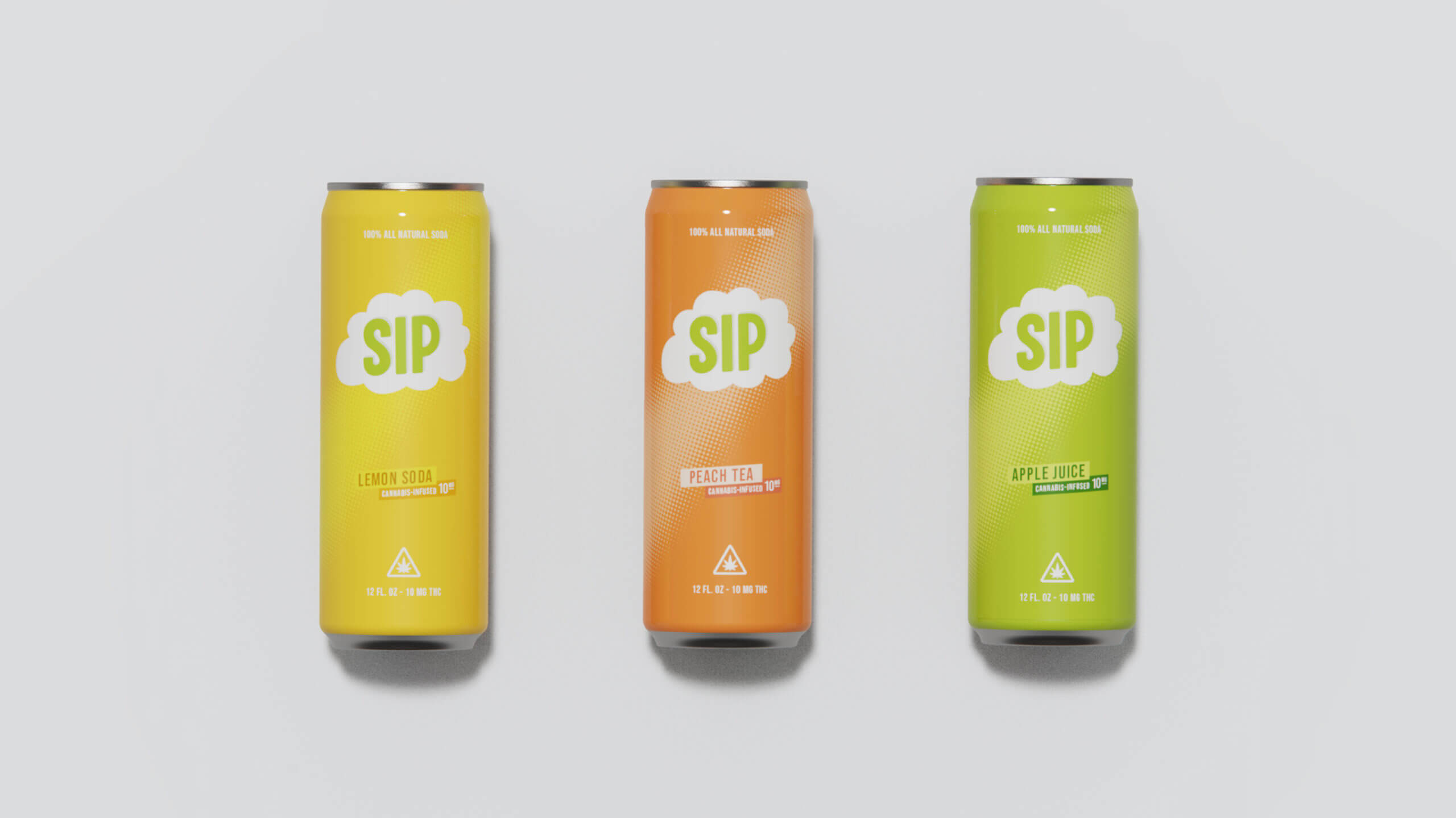
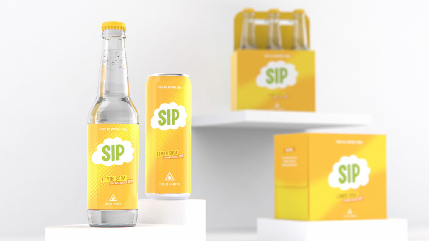
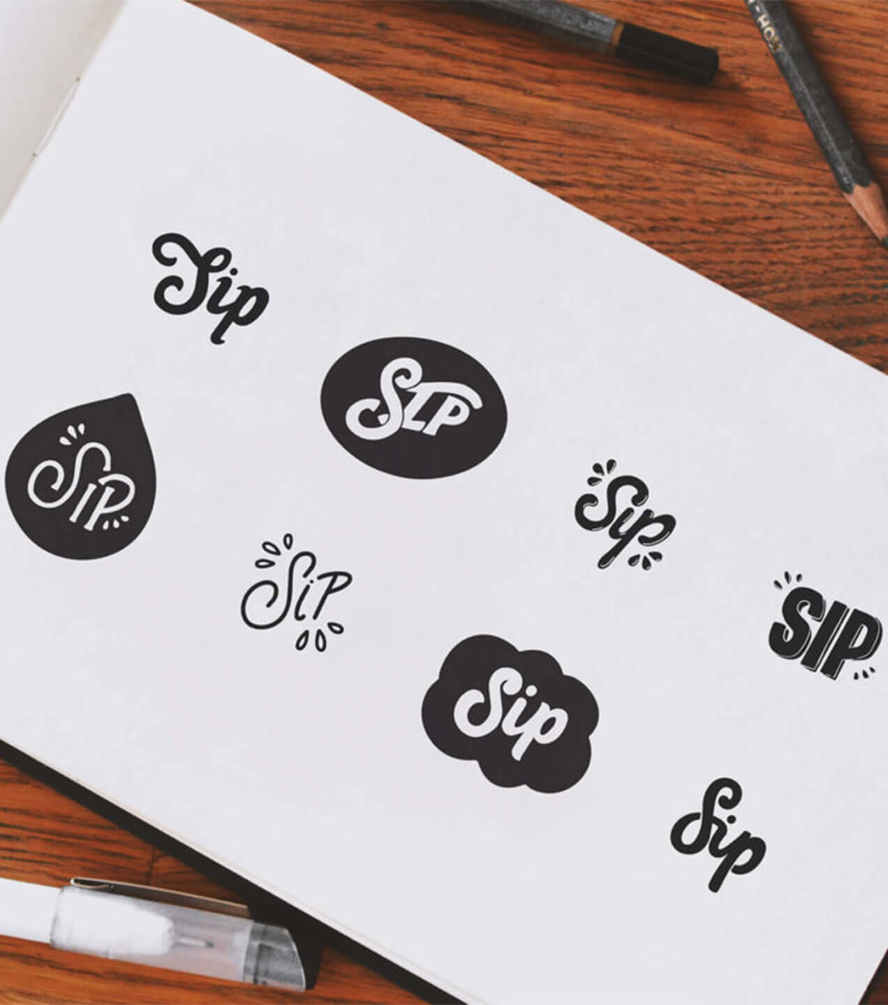
Sip—Bubbly Beverages
In contrast to the comforting aesthetic of Bite, Sip relies on a much more energetic and lighthearted approach. The client’s vision was to generate a comic book, graphic-inspired brand identity. Each product signals its flavor profile with a distinctly bright, saturated background. A consistent logotype treatment unifies the offer, the only beverage product line within the Commcan portfolio.
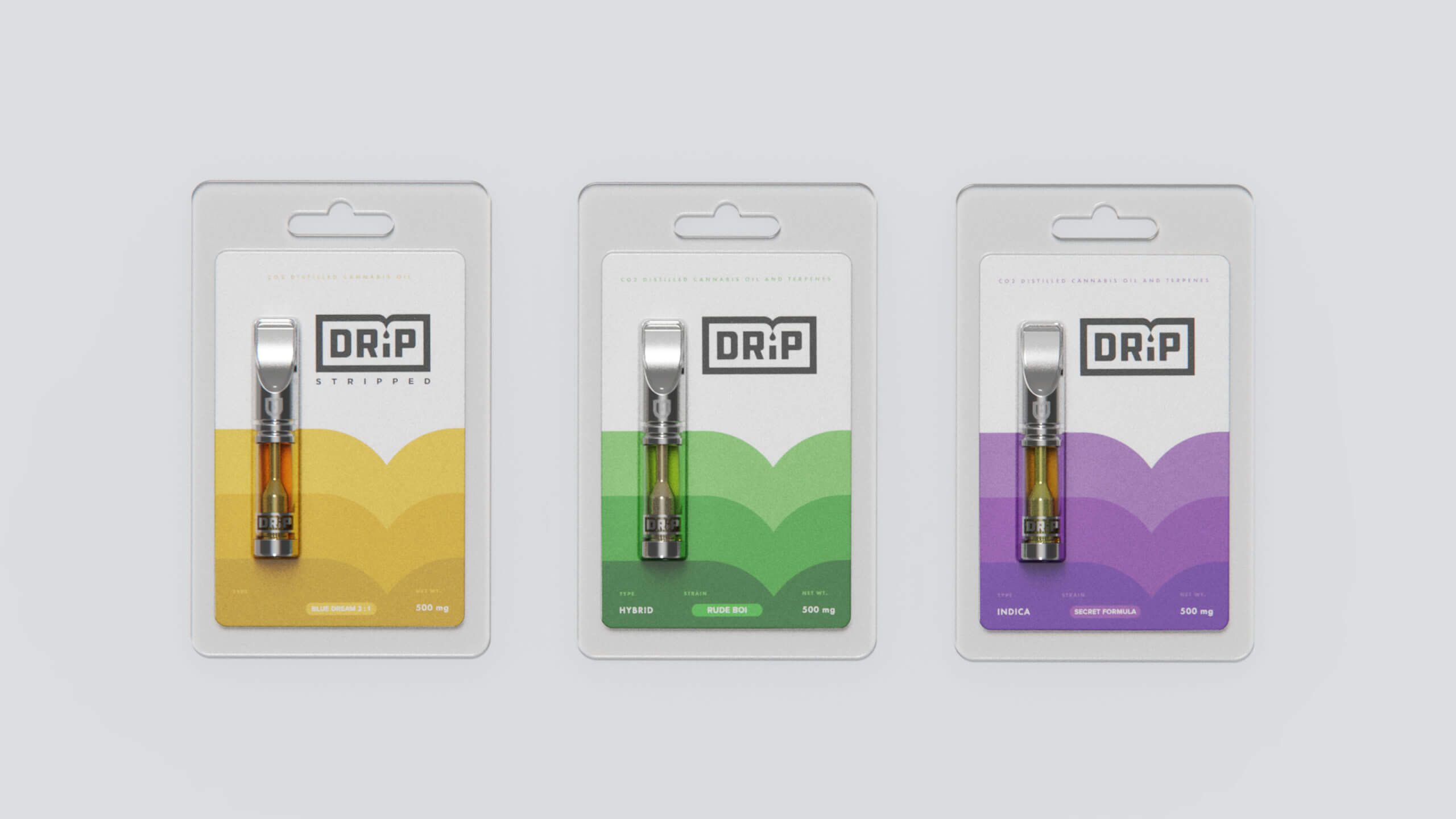
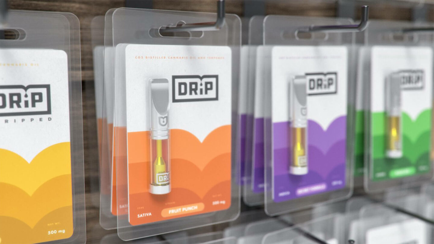
Drip—Delightful Distillates
The most recent addition to the Commcan sub-brand portfolio is Drip. This line of CO2 distillates offers a clean and fast user experience. The wordmark is a subtle representation of the oil-based product. Drawing on the idea of transparency, each product is displayed in a clear blister pack, allowing the customer to quickly recognize the product enclosed. The design utilizes a 4-way color palette, aligned to the four strain variants, to help guide the purchase experience.

/ Commcan: The Outcome
A market responsive brand experience
Commcan is now a flourishing cannabis provider in the Commonwealth of Massachusetts and a recognizable branded offer in a category with few brand share leaders. Its core product offer and sub-brand portfolio have well-positioned the business for further growth as new retail opportunities emerge.


-
Sprout’s collaborative and holistic approach led to our now easily recognizable Hex and Stripes logo in iconic black and gold. A simple design full of deeper meaning. This initial success made the decision to stick with Sprout on our various sub-brands easy.
&