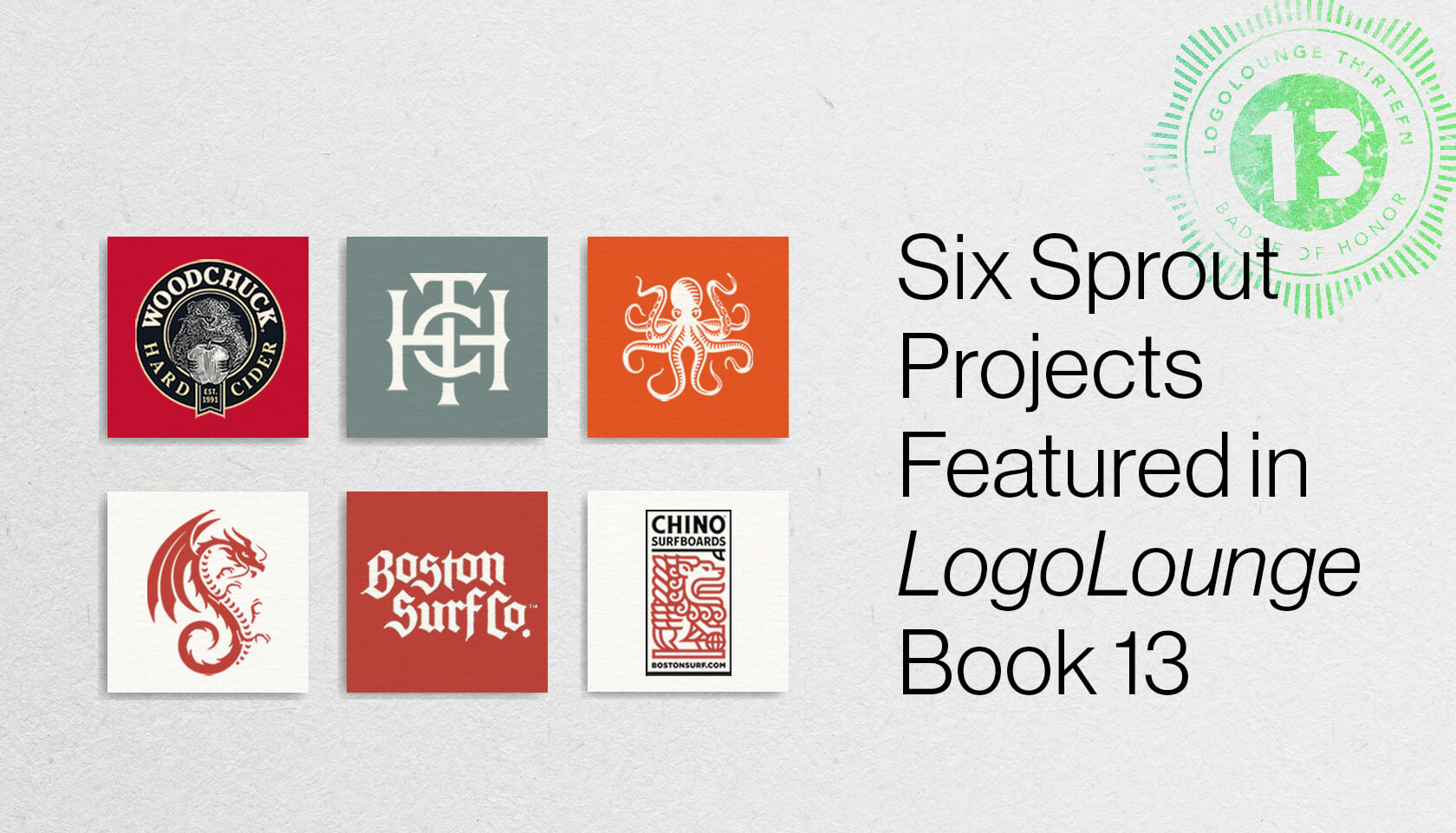
We are proud to announce that six logos from our portfolio have been selected for LogoLounge Book 13. The bestselling LogoLounge book series features the year’s best in identity design from designers from around the world. The winning logos are compiled and organized into a book, published both in print and digitally.
With over 39,000 logos from 60 countries worldwide submitted for consideration in this year’s book, we are honored to have six projects from the Sprout Studios graphic design team make the cut.

Branding ● Packaging ● Strategy
Woodchuck Hard Cider
To celebrate 25 years in business, Woodchuck Hard Cider enlisted Sprout graphic designers to refresh their logo, packaging, and label. The company wanted to reposition the brand, and bring back the iconic ‘Chuck.’ We designed the packaging and labeling system to accommodate the five core cider varieties Woodchuck offers, as well as seamlessly introduce seasonal and limited editions ciders. Soon after the re-brand, Chuck quickly regained its #1 status in the hard cider market and has remained there ever since. Read more.

The Heirloom Collective
Branding ● Packaging ● Strategy ● Digital ● Environmental
Sprout created the branding strategy for a chain of dispensaries throughout MA. After multiple brainstorms, we arrived at the name: The Heirloom Collective aka THC. We leveraged typography, patterning, and messaging applications to position the company as a premium and thoughtful regional dispensary leader. Comprehensive brand guidelines directed the application of the logo hierarchy across packaging, merchandise, and THC’s retail and digital environment. Read more.

Drop In Coalition
Branding ● Strategy
We collaborated with the nonprofit Drop In Coalition to create a brand identity for their STEAM-based surfing program for children from underrepresented communities. The primary mark is an amalgamation of both sea and education: a curious, mischievous, but sophisticated octopus. The octopus brings together the eight founders of the Drop In Coalition, their love of the ocean, and the power of education. We then designed and developed a system of supporting, secondary marks that Drop In leveraged for collateral and merchandise, to make Drop In Coalition an accessible lifestyle brand for a younger audience. Read more.

Boston Surf Company
Branding ● Digital
Boston Surf Co., a Sprout Labs company, was developed to embody the New England surf spirit. We designed a custom apparel line that unites surfers from Massachusetts to Maine. Our graphic design team also developed a custom e-commerce website that embodies the spirit of Boston Surf Co. Read more.

Chino Surfboards
Branding ● Digital
The Sprout Studios graphic design team developed a unified brand language for Chino Surfboards including a range of logos and word marks for different use cases, boards and custom apparel. Read more.


